Thursday, March 31, 2016

Fear & Greed Index


Courtesy of CNN.Money
Courtesy of CNN/Money

Looking back at previous times when this index was in the area of 80 or above, there have been shallow or greater corrections.   How do we know which type to expect?  There are several things to review.  Two charts that have been posted on this blog are the Average Election Year Pattern and another is the composite of all 8th years of a two term president.  There are patterns that appear in each of these charts.

These charts are at the following link
 http://justsignals.blogspot.com/2016/03/lets-review-2016-again.html

When reviewing these charts, you can see that a high is April +/- is common.  Note that these charts are a composite of many individual years.  This means that each of those years were NOT all the same, but, they did rhyme.

The Fear & Greed Over Time chart above indicates that the market is OB and it is also approaching the area where highs have developed in the past Election Years and the 8th year of two term presidents, which by the way, were also election years.

The main difference between the two is that the general election year pattern has a positive July to Dec and the 8th year of two term presidents have a negative July to Dec. (5 of 6 times)  and have had an average loss of 13.9%.

Two other indicators also may come into play this year.  One is the long term cycles (LT) and the other is the escape thrust that we had for the 3 days after the February low.  The LT cycles suggest a positive 2016 second half and the escape thrust, since 1970, has been up 12 months later, 8 of 8 times.

The strongest evidence, so far, suggests that the second half of 2016 may be up.  No guarantee that will happen, so keep watching your indicators for any possible changes.

Keep following JustSignals using Twitter, @StockTwits or Follow By Email. 
Just submit your email address in the box on the Blog homepage
This has been posted for Educational Purposes Only.   Do your own work and consult with Professionals before making any investment decisions.  
Past performance is not indicative of future results


Tuesday, March 29, 2016

What is Picasso saying ?

Again, Picasso is not displaying any swings going forward for the DJIA.  So it is not easy to interpret a near flat line with an upward bias into April & "maybe" May.  But, GE is the only stock left in the Dow30 that is one of the original DJIA stocks.  Although the price charts of GE & the DJIA are not similar, their changes in trend have been similar in the past.  Due to this similar trend between GE & the DJIA, it is best that Picasso's readings for GE be used temporarily as a proxy for the DJIA.

Picasso's dates are always +/- and note to watch for inversions as they sometimes happen
No dates available for this post.
The best thing to do is to review the following past posts to see the (1)Average Election Year Pattern & (2) the Last Year of a Two term President Pattern.

Both charts can be seen at the following link
http://justsignals.blogspot.com/2016/03/lets-review-2016-again.html

The market is short term OB and the cycles look positive.  Since the Feb 11th low, the market displayed what some call an escape thrust.  We had three consecutive days of greater than 1.50% gains.  This momentum appears to be stronger than most believe.  

More, as it unfolds.

Keep following JustSignals using Twitter, @StockTwits or Follow By Email. 
Just submit your email address in the box on the Blog homepage
This has been posted for Educational Purposes Only.   Do your own work and consult with Professionals before making any investment decisions.  
Past performance is not indicative of future results

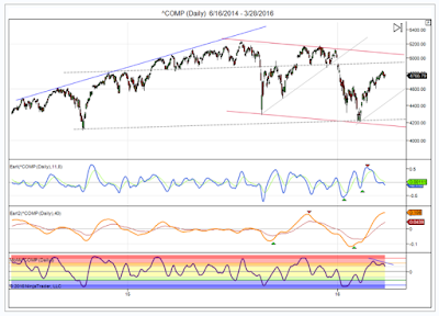
Earl2 making major high

Courtesy By Danny of LunaticTrader

By Danny
This index topped out at 4835 early in the week, right in the area where stronger overhead resistance is likely. The Earl indicator (blue line) is already back in the bottom zone, which means another push higher is not out of the question at this point. But the slower Earl2 (orange line) is making a major high and about to turn lower, and that is usually a headwind for any rally attempts. The MoM indicator is painting a bearish divergence, and that may keep a lid on the market as well.All in all this is not a very favorable setup for trades on the long side. The more likely scenario is consolidation, probably sideways with dips as low as 4600 for Nasdaq.
Keep following JustSignals using Twitter, @StockTwits or Follow By Email. 
Just submit your email address in the box on the Blog homepage
This has been posted for Educational Purposes Only.   Do your own work and consult with Professionals before making any investment decisions.  
Past performance is not indicative of future results
Thursday, March 24, 2016

Let's review 2016 again

In prior posts there were discussions about:

1) The intermediate cycles have been looking for a market correction in the first half of 2016.
2) The pattern of the Average Election Years, see chart below.
3) The final year of a two term Presidency.  In 5 of the last 6 times, the DJIA dropped an average of 13.9%.  See a new chart below that is a composite of the last year of two term Presidents over the last 100 years. FDR served for 3 terms so the 8th & 12th years were used in this chart.  Some changes in trend dates were noted on the chart and they happen to be close to the actual turn dates so far in 2016,  Take a look for yourself.


Observation:
Note that in both of these charts the first six months are pretty much in sync.  The last six months trend in opposite directions.

On March 4,2016 in the post, 2016 Bear or Bull?, it discussed the 3-4 day kickoff, escape thrust, and the subsequent 12 months.  The market was up 12 months later, in each of these times, but, in some years the market tested the lows that were made right before the 3-4 day kick off.  So based on the 2 charts above it is possible that the February2016 low may be tested.  What happens after that and in the second half of this year will be up to Mr. Market and for all of us to monitor very carefully.  More on this as it unfolds. 


Keep following JustSignals using Twitter, @StockTwits or Follow By Email. 
Just submit your email address in the box on the Blog homepage
This has been posted for Educational Purposes Only.   Do your own work and consult with Professionals before making any investment decisions.  
Past performance is not indicative of future results

Time to Take Profits - UBS

Time to take profits - UBS

UBS technicians Michael Riesner and Marc Muller, who called both of the most recent selloffs, are out with a note telling clients to take profits on the S&P 500:
"Last week, we saw the suggested overshooting into expiration and the SPX reached the upper end of our projected late Q1/early Q2 target at 2050, which leaves the short-term picture in the U.S. unchanged as to what we highlighted last week. With the rally of the last few weeks and looking at our daily trend work, the SPX has reached its most overbought position since 2009!! Together with significant non-confirmations in our medium-term momentum work, and trading in the time window of our late Q1/early Q2 top projection, we see the market vulnerable for a significant reversal this week, which we would see as the beginning of a tactical top building process and subsequent correction into deeper Q2. We reiterate our last week’s comment and would not chase the market on current elevated levels.
"After being aggressively oversold, we saw the February 11th risk bottom as the basis for a multi-week bear market rally in global equities into the late March/early April timeframe with a price target 2000/2050 in the SPX before starting a new significant tactical down leg into deeper summer. Last week, we said that a final overshooting into expiration is still likely, but particularly in the week after triple witching we very often see important tactical trend reversals in the market.
"The February/March rebound was nearly vertical, which is not sustainable. With last week’s extension our daily trend work has reached its most overbought position since 2009. Together with our weekly momentum reaching overbought extremes we have a relatively high likelihood of seeing the market move into an important medium-term top followed by a significant setback. Even if our big picture market view (U.S. and global equity markets are in a cyclical bear market that we expect to continue into Q1 2017) proves to be too bearish, with such an indicator setup we should see the US market minimum ahead of a multi-week consolidation pattern, where we should see higher volatility and therefore a significant pullback."

The following charts were taken from the last article on this blog
By UBS technicians Michael Riesner and Marc Mulle
Link to that article
http://www.zerohedge.com/news/2016-03-23/one-most-accurate-forecasters-2016-sp-most-overbought-2009-sell


Keep following JustSignals using Twitter, @StockTwits or Follow By Email. 
Just submit your email address in the box on the Blog homepage
This has been posted for Educational Purposes Only.   Do your own work and consult with Professionals before making any investment decisions.  
Past performance is not indicative of future results

Wednesday, March 23, 2016

An Accurate 2016 Forecaster

One Of The Most Accurate Forecasters Of 2016: "S&P Is The Most Overbought Since 2009: Sell!"


 At ZEROHEDGE.COM

Lately being a bear has meant sharing quite a crowded field. First it was JPMorgan, which not only said to sell any rallies, but three weeks ago said it had gone "underweight stocks for the first time since the financial crisis"; then technicians such as Evercore ISI summarized their sentiment as follows "I'm out; my bullish tactical call is over", and then on Monday, even Goldman jumped on the bandwagon urging clients "to go to cash" ahead of "expected elevated volatility" and that the "current relief rally" is almost over.
Today, it's the turn of UBS' technicians, Michael Riesner and Marc Muller, best known for calling both of the last two market selloffs in advance (and the concurrent jump in gold), as well as timing the Feb.11 market bottom with uncanny accuracy, when they joined the bearish chorus with one simple plea: "SPX Reaching 2050 Target … Take Profit/Sell!"
This is their call in a nutshell:

See great charts and the full article at the following link

Monday, March 21, 2016

2 Term Pres. Bad News 4 the Stock Market

The end of a two-term president is usually bad news for the stock market

By Myles Udland at BusinessInsider.com

November 2, 2015 


Barack Obama has 15 more months left in the White House. (Written Nov. 2,2015)
And as his eight years in office come to a close, investors looking at the end of recent two-term presidencies might have reason to be nervous.

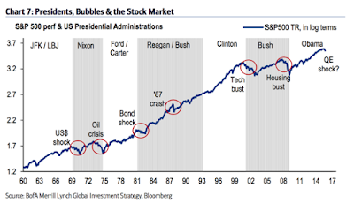
In a note to clients on Sunday, Michael Hartnett and his team at Bank of America Merrill Lynch looked at the relationship between presidential terms, the stock market, and asset bubbles that have cropped up during those years.
And so while the Obama presidency has seen enormous stock market and job market gains as the economy has recovered — however slowly — from the financial crisis, there might be reason to get nervous about what the next few years hold.

As Hartnett and his team note, four notable financial mispricings have led to significant market events at the end of recent two-term presidencies: the overvaluation of the US dollar after JFK/LBJ, the undervaluation of bonds after Ford/Carter, the overvaluation of tech after Clinton, and the overvaluation of housing after Bush.

2015 has already proven a challenging year for investors, a claim that no one is likely to deny even if the last two months of the year see stock markets continue their big October rally.

As Hartnett writes, "2016 should be another tough year for markets, another year of 'deflationary expansion,' and a perilous transition to the promised normalization of Higher Growth & Higher Rates."

Here's the unsettling chart:
Keep following JustSignals using Twitter, @StockTwits or Follow By Email. 
Just submit your email address in the box on the Blog homepage
This has been posted for Educational Purposes Only.   Do your own work and consult with Professionals before making any investment decisions.  
Past performance is not indicative of future results

Thursday, March 17, 2016

SPY Buying Pressure


Today the buying pressure broke out above several tops.  This pattern goes back to February 2015.  Today's buying pressure broke through the horizontal red line connecting highs from February 2015, October 2015 & February 2016. 
Other break outs were noted by red horizontal lines, a green circle at the break out, a yellow vertical line showing where the SPY was at the break out & a green arrow showing the subsequent move in the SPY after the break out.
In each of the prior three break outs the SPY went up each time before a pullback or correction.  Note that this chart only goes back to January 2014 and there are no other examples shown here prior to that date.

Keep following JustSignals using Twitter, @StockTwits or Follow By Email. 
Just submit your email address in the box on the Blog homepage
This has been posted for Educational Purposes Only.   Do your own work and consult with Professionals before making any investment decisions.  
Past performance is not indicative of future results

Fear & Greed Index & more

Courtesy of CNN/Money

As you can see in the chart above the stock market has entered an area of extreme greed where several tops or highs have occurred.  It does not mean that one will occur now or at this level, but, the probability is better than if the stock market was in an area close or closer to extreme fear.


On Sunday February 21,2016, the post, What's Picasso Saying, made the following statement.

What's Picasso saying ?

Picasso is not displaying any swings going forward for the DJIA.  So it is not easy to interpret a near flat line with an upward bias.  But, GE is the only stock left in the Dow30 that is one of the original DJIA stocks.  Although the price charts of GE & the DJIA are not similar, their changes in trend have been similar in the past.  Due to this similar trend between GE & the DJIA, it is best that Picasso's readings for GE be used temporarily as a proxy for the DJIA. So here are those results.

Hindsight has 20/20 vision, but, the comments highlighted in BLUE on February 21st could not have been any clearer at that time.  Looking at the DJIA chart today you will see a gradual rise since that time.

So where are we going from here?  The short term and intermediate term cycles are both suggesting a mid year pullback.  The short term cycles suggest a high late April - early May and the intermediate term cycles suggest something very similar.  What is interesting here is the Election Year Pattern shown many times on this blog also suggests a similar market direction as the cycles.  For those that have not seen this chart, here it is again.  This chart shows a high in early April and a low in late May.  Although this is about one month earlier than the cycles, it is still very similar.

Courtesy of www.chartoftheday.com

As we get closer more updates will be made.

Keep following JustSignals using Twitter, @StockTwits or Follow By Email. 
Just submit your email address in the box on the Blog homepage
This has been posted for Educational Purposes Only.   Do your own work and consult with Professionals before making any investment decisions.  
Past performance is not indicative of future results
Monday, March 14, 2016

RYNVX had a big change today

Last posted on February 18,2016
Updates in BLUE - RYNVX inched closer to another extreme reading

RYFXX - Rydex US Government Money Market
RYNVX - Rydex Nova Fund Investor Class (Long Fund)
RYURX -  Rydex Inverse S&P 500® Strategy Fund Investor Class (Inverse Fund)

RYFXX   3-10-09   $1,367Mil   3-10-15   $655Mil     9-9-15     $1,434Mil
                                                                                 9-14-15    $1,451Mil    
                                                                               10-26-15       $862Mil
RYNVX    3-11-09  $22Mil     5-14-15  $177Mil          9-4-15         $53Mil 
                                                                                    9-14-15      $52Mil
                                                                                  10-26-15    $140Mil
                                                                                  11/27/15     $182Mil
                                                                                  12/10/15     $187Mil
                                                                                  12/29/15     $189Mil
                                                                                   1/15/16        $51Mil
                                                                                   1/19/16        $37Mil
                                                                                   2/18/16        $37Mil
                                                                                   3/11/16        $52Mil
                                                                                   3/14/16      $159Mil
RYURX   3-9-09        $353Mil   5-4-15   $58.34Mil      9-9-15      $148Mil
                                                                                    9-14-15    $172Mil
                                                                                  10-26-15    $117Mil

Friday March 11,2016 the Long Fund was $52Mil and increased to $159Mil today.
This big one day increase in the RYNVX long fund displays optimism in the market...

Keep following JustSignals using Twitter, @StockTwits or Follow By Email. 
Just submit your email address in the box on the Blog homepage
This has been posted for Educational Purposes Only.   Do your own work and consult with Professionals before making any investment decisions.  
Past performance is not indicative of future results

What is Picasso saying ?

Again, Picasso is not displaying any swings going forward for the DJIA.  So it is not easy to interpret a near flat line with an upward bias.  But, GE is the only stock left in the Dow30 that is one of the original DJIA stocks.  Although the price charts of GE & the DJIA are not similar, their changes in trend have been similar in the past.  Due to this similar trend between GE & the DJIA, it is best that Picasso's readings for GE be used temporarily as a proxy for the DJIA. So here are those results.

Picasso's dates are always +/- and note to watch for inversions as they sometimes happen
3/15L
3/18H
3/21L
3/29H

The market is short term OB and the cycles look positive.  SInce the Feb 11th low, the market displayed what some call an escape thrust.  We had three consecutive days of greater than 1.50% gains.  This momentum appears to be stronger than most believe.  

Not a bad idea to look at this post again
2016 Bear or Bull ?
http://justsignals.blogspot.com/2016/03/2016-bear-or-bull.html

Keep following JustSignals using Twitter, @StockTwits or Follow By Email. 
Just submit your email address in the box on the Blog homepage
This has been posted for Educational Purposes Only.   Do your own work and consult with Professionals before making any investment decisions.  
Past performance is not indicative of future results

Friday, March 11, 2016

chart: SPY intraday signals


Courtesy of TradeStation.com
 
The crossovers in both red or green circles must be present for a signal to be valid.
 
Keep following JustSignals using Twitter, @StockTwits or Follow By Email. 
Just submit your email address in the box on the Blog homepage
This has been posted for Educational Purposes Only.   Do your own work and consult with Professionals before making any investment decisions.  
Past performance is not indicative of future results

Thursday, March 10, 2016

Observation in 1984 & 2016


As an after thought, it was noticed that 1984 was also an election year just like 2016.  It was also noticed that in 1984 the last low after the thrust days was four months later (see yellow lines in the 1984 chart below).  In all of the other years the rally started earlier than in 1984.  
Why is this being brought up?  
If we add those same four months to the 2016 thrust days in mid February we come out to June 2016 +/- and this coincides with the late May/early June low before the suggested rally starts in the Average Election Year chart lower in this post.


The above charts are from the post on:

Friday, March 4, 2016

2016 Bear or Bull ?

The years discussed in the March 4,2016 post were 1970, 1974-75, 1982-83, 1984-85, 1987-88, 2002-03 and 2011-12.  
Above each of those charts start at the black oval around the thrust dates.  What is very interesting, when you line up all the years from that beginning point you can easily see when the market made a higher or lower bottom in the next 30-60 +/- days.  These bottoms are highlighted in yellow vertical lines.  If one could not get in near the bottom, then these dates were the next buying opportunity before the market moved higher.  Go back to the post on March 4,2016 to see the chart data in each of these periods.   The market was higher 12 months from the 3-4 consecutive up days of at least 1.50%.

Again the chart of the Average Election Years is shown so you can see the similarity in the price movement in the charts above as compared to the chart below.  The starting points of the charts above maybe compared to mid February in the chart below and in the chart of 2016 since a bottom was last made on Feb 11,2016.
So far, 2016 is following these patterns fairly close.  It is not certain that this will continue, but, it is likely that it might.  These charts are not to be used as trading or investing signals.  They are only a guide to show you what has happened in the past.

Keep following JustSignals using Twitter, @StockTwits or Follow By Email. 
Just submit your email address in the box on the Blog homepage
This has been posted for Educational Purposes Only.   Do your own work and consult with Professionals before making any investment decisions.  
Past performance is not indicative of future results


Wednesday, March 9, 2016

2016 Buying Opportunity ?


The above charts are from the post on:

Friday, March 4, 2016

2016 Bear or Bull ?

The years discussed in the March 4,2016 post were 1970, 1974-75, 1982-83, 1984-85, 1987-88, 2002-03 and 2011-12.   
Above each of those charts start at the black oval around the thrust dates.  What is very interesting, when you line up all the years from that beginning point you can easily see when the market made a higher or lower bottom in the next 30-60 +/- days.  These bottoms are highlighted in yellow vertical lines.  If one could not get in near the bottom, then these dates were the next buying opportunity before the market moved higher.  Go back to the post on March 4,2016 to see the chart data in each of these periods.   The market was higher 12 months from the 3-4 consecutive up days of at least 1.50%.

Again the chart of the Average Election Years is shown so you can see the similarity in the price movement in the charts above as compared to the chart below.  The starting points of the charts above maybe compared to mid February in the chart below and in the chart of 2016 since a bottom was last made on Feb 11,2016.
So far, 2016 is following these patterns fairly close.  It is not certain that this will continue, but, it is likely that it might.  These charts are not to be used as trading or investing signals.  They are only a guide to show you what has happened in the past.


Keep following JustSignals using Twitter, @StockTwits or Follow By Email. 
Just submit your email address in the box on the Blog homepage
This has been posted for Educational Purposes Only.   Do your own work and consult with Professionals before making any investment decisions.  
Past performance is not indicative of future results


Monday, March 7, 2016

chart: GLD


Currently shows negative divergence.

Keep following JustSignals using Twitter, @StockTwits or Follow By Email. 
Just submit your email address in the box on the Blog homepage
This has been posted for Educational Purposes Only.   Do your own work and consult with Professionals before making any investment decisions.  
Past performance is not indicative of future results

Sunday, March 6, 2016

charts: DIA & TLT

Courtesy of ChaikinAnalytics.com


Courtesy of ChaikinAnalytics.com
DIA
As of Friday 3/4/16 there is a bearish rising wedge
Went from oversold to overbought
Relative strength got weaker while the above mentioned items developed

TLT
As of Friday 3/4/16 there is a bullish falling wedge
Chaikin Money Flow is still above zero and in the green
Went from overbought to oversold

In general, there is an inverse correlation between the stock market and Treasury Bonds although not a perfect one, but, when the stock market falls investors display a flight to quality and you can see that in the two charts above.

Keep following JustSignals using Twitter, @StockTwits or Follow By Email. 
Just submit your email address in the box on the Blog homepage
This has been posted for Educational Purposes Only.   Do your own work and consult with Professionals before making any investment decisions.  
Past performance is not indicative of future results

Market Overbought ?


When looking to see if markets are either overbought or oversold you sometimes may need to look at more than one chart.  For example there are four charts above, DJIA, SPY, Russel 2000 & Advance Decline.  Each chart may give clues at different points in time.  The yellow vertical lines highlight several overbought areas.  Note that the yellow lines may or may not occur on the same dates, but, the market had different degrees of a pullback near each of the noted areas.

Keep an eye on the Picasso turn dates and watch your indicators.

Keep following JustSignals using Twitter, @StockTwits or Follow By Email. 
Just submit your email address in the box on the Blog homepage
This has been posted for Educational Purposes Only.   Do your own work and consult with Professionals before making any investment decisions.  
Past performance is not indicative of future results


Friday, March 4, 2016

2016 Bear or Bull ?

This post is about an article found on MarketWatch.com
The link to this article can be found at the bottom of this post.

"Historical pattern says the risk of a 2016 bear market is zero"
 By Simon Maierhofer
Published: Feb 25,2016  12:57p.m. ET

In physics, escape velocity is the minimum speed needed for an object to break free from the gravitational attraction of a massive body. What is the “escape velocity” needed for stocks to break their down trend?
Unlike in physics, there is no fail-proof formula for stocks. However, based on history, the S&P 500 just rallied strongly enough to end its down trend. How so?
Stock-market 'escape velocity'
On Feb. 12, 16 and 17, the S&P 500 gained more than 1.5% a day for three consecutive days. Since 1970, this has happened only eight other times. The table below lists each occurrence along with the daily consecutive gains, and the return a year after the last “kickoff” day.


The charts at the bottom of the column provide a snapshot of each kickoff rally (dashed green line) and how the S&P 500 did 60 trading days (about three months) prior, and 255 trading days (above one year) thereafter.
JustSignals Comment - The above mentioned charts can be seen in the full article (see link below).  The charts below show a longer period leading up to the 3-4 day "kickoff" or thrust days which is circled in black.  Also included in the charts are moving averages, kickoff days and the percentage gains one year later as noted in the chart above.


Observations by author
  • Every single time the S&P 500 gained more than 1.5% a day for three consecutive days, it traded higher a year later.
  • The S&P 500 violated the low set prior to the kickoff move only twice (1987, 2002). Both times it bounced back quickly.
  • In 2016, the S&P 500 closed at a 52-week low before its kickoff rally. In 1970, 1987 and 2011, the S&P 500 also closed at a 52-week just before soaring higher.
  • Obviously, kickoff rallies like this are not the only factor driving stocks, but this particular pattern confirms the six reasons for a stock market rally listed by the February 11 Profit Radar Report (all six reasons are available here).
  • The Feb. 11 Profit Radar Report recommended buying the S&P 500 at 1,828 (after it fell as low as 1,810) in anticipation of a sizeable rally.
  • As compelling as this historic pattern may be, tunnel vision is a luxury investors can't afford. It's worth noting that the 2016 kickoff is weaker (in terms of consecutive percentage gains) than prior kickoff rallies, and our major-market-top liquidity indicator raised a caution flag in May 2015.
  • The scope of this rally has yet to be revealed, and a break below the February low is still possible (like in 1987 and 2002).
  • Regardless of the S&P's near-term path, history says we shouldn't under estimate this kickoff rally. Acting on the sentiment-based buy signal at S&P 1,828 provided a low-risk entry point and insurance against a runaway rally.
Link to full article
 http://www.marketwatch.com/story/historic-pattern-says-the-risk-of-a-2016-bear-market-is-zero-2016-02-25

JustSignals Comments:

Average Election Year : 
Two of the years in the charts above are Election Years 1984 & 2016.  Also again note that, the S&P 500 violated the low set prior to the kickoff move only twice in 1987& 2002.  So it can happen again with the Average Election Year chart suggesting another low in the June +/- time frame.  Is this guaranteed?  Of course not !  But look at and study all the charts including the Average Election Year chart and come to your own conclusions.

The Intermediate Term Cycles have been looking for a market correction in the first half of 2016 and they suggest a bias up in the second half of 2016.   The Intermediate Term Cycles do look very ominous for several years after 2016. 
There is other information also suggesting these moves in 2016.
1) The pattern of the Average Election Years, see chart above.
2) The 7th year of a two term President.  2015 was the first time since 1939 that the DJIA was down in the 7th year of a Presidency.  The DJIA fell about 1/3 in 1940-1941.  Note that 1940 was also an election year and it did follow a similar pattern to the one in the chart above with a mid year low.
3) The final year of a two term Presidency.  In 5 of the last 6 times, the DJIA dropped and average of 13.9%.  So far in 2016 the DJIA fell about 10% from 12/31/15 to the closing low in Feb2016.
4) No Santa rally this year.  Yale Hirsch said, " If Santa Claus should fail to call, bears may come to Broad and Wall".  Was the January & February lows the low for the year or will there be another low?
5) The weekly chart shows two bullish candle sticks.  One for the week of 1/18/16 & another for the week of 2/8/16.
6) The monthly chart shows one bullish candle stick for the month of February 2016.

The market does not go straight up or straight down.  In all the charts above there were several changes in trend.  Be nimble and be careful.  The markets always tries to shake out as many investors and traders as possible.  This is nothing new. 

Keep following JustSignals using Twitter, @StockTwits or Follow By Email. 
Just submit your email address in the box on the Blog homepage
This has been posted for Educational Purposes Only.   Do your own work and consult with Professionals before making any investment decisions.  
Past performance is not indicative of future results


Thursday, March 3, 2016

STIX Indicator Update

An indicator that is not in most platforms is STIX
Definition of STIX
By Investopedia
A short-term trading oscillator that compares the amount of volume flowing into advancing and declining stocks. The STIX oscillates around the 50 level, with values over 50 generated when advancers outnumber decliners, and values less than 50 resulting when advancers are less than decliners. The trading range for the STIX is generally between 42 and 58, with levels below 42 indicating extremely oversold conditions, and levels above 58 denoting extremely overbought conditions.

Rules:
1- If STIX gets as low as 45, the market is almost always a buy, except in a raging bear market.
2- The market is fairly overbought if STIX rises to 56; and except in a new bull market , it's wise to sell if STIX should go over 58.
NOTE - Low of 28 & High of  69 were both made in 1932.

At the close yesterday the STIX was 58.7 at 199.00 in the SPY

Keep following JustSignals using Twitter, @StockTwits or Follow By Email. 
Just submit your email address in the box on the Blog homepage
This has been posted for Educational Purposes Only.   Do your own work and consult with Professionals before making any investment decisions.  
Past performance is not indicative of future results