 |
| Courtesy of StockCharts.com |
Tuesday, February 28, 2017
charts: 12 or more DJIA consecutive up days
Going back to 1920 there were found 5 times with 12 or more consecutive up days.
Note that the market made additional gains after each of these consecutive up days and that in 2 periods the consecutive days were during the blow off stage before the crash in 1929 and in 1987.
Here are the 5 charts.. |
| July 1927 - Courtesy of Worden Bros. |
 |
| June/July 1929 - Courtesy of Worden Bros. |
 |
| Feb/March 1933 - Courtesy of Worden Bros. |
 |
| Nov/Dec 1970 - Courtesy of Worden Bros. |
 |
| Jan 1987 - Courtesy of Worden Bros. |
Just submit your email address in the box on the Blog homepage
This has been posted for Educational Purposes Only. Do your own work and consult with Professionals before making any investment decisions.
Past performance is not indicative of future results
Monday, February 27, 2017
RYNVX Another Extreme Market Cap
Since Feb 10,2017 the market capitalization in the RYNVX Long Fund was about $75Mil.
As the DJIA kept making new ATH's this Long Funds balance was between $75-$77Mil.
Between Friday and today this funds Market Capitalization grew to $308Mil.
This is the largest amount in the Fund since March 2009.
On Jan 20,2016 and on Feb 9,2016 when the stock market sold off this fund had a total of $36Mil.
In general the public has been decreasing their positions in Long Funds when the market corrects and the public has been increasing their positions in Long Funds when the market rallies.
RYNVX - Rydex Nova Fund Investor Class (Long Fund)
This high dollar amount in the RYNVX long fund displays greed in the market...
Keep following JustSignals using Twitter, @StockTwits or Follow By Email.
Just submit your email address in the box on the Blog homepage
This has been posted for Educational Purposes Only. Do your own work and consult with Professionals before making any investment decisions.
Past performance is not indicative of future results
First Day of Month Gains
This Wednesday is March 1st and the first
trading day of the new month. The following post was last made on February 1st, so now is a good time for a refresher on this subject.
Note that President Trump will be addressing Congress on Tuesday night, the last day of February.
* Take a look at the 3rd chart below by JEFFREY A. HIRSCH, editor-in-chief of the Stock Trader's Almanac. The data shows that the month of May has had the largest total DJIA points gained on the first day of the month from September 1997 to December 2012.

Browsing the Fidelity Customer Service Learning Center can be very useful
Monthly trading patterns: Human behavior shapes market activity
By Jeffrey A. Hirsch
www.stocktradersalmanac.com
Click on the following link for the full article
http://bit.ly/1HbpM7W
The following is an excerpt from the article
Monthly cash inflows into S&P stocks
Note that September 1997 through October 2000 racked up a total gain of 2632.39 Dow points on the first trading days of these 38 months (winners except for seven occasions). But between November 2000 and September 2002, when the 2000-2002 bear markets did the bulk of their damage, frightened investors switched from pouring money into the market on that day to pulling it out in fourteen months out of twenty-three. This netted a 404.80 Dow point loss. The 2007-2009 bear market lopped off 964.14 Dow points on first days in 17 months from November 2007 to March 2009. First days had their worst year in 2011, declining seven times for a total loss of 644.45 Dow points.
First days of June have performed worst. Triple digit declines in four of the last five years have resulted in the worst net loss. August is the second net loser. In rising market trends, first days perform much better as institutions are likely anticipating strong performance at each month’s outset. S&P 500 first days track the Dow’s pattern closely but NASDAQ first days are not as strong with weakness in April, August, and October.
Note that President Trump will be addressing Congress on Tuesday night, the last day of February.
* Take a look at the 3rd chart below by JEFFREY A. HIRSCH, editor-in-chief of the Stock Trader's Almanac. The data shows that the month of May has had the largest total DJIA points gained on the first day of the month from September 1997 to December 2012.
Browsing the Fidelity Customer Service Learning Center can be very useful
Monthly trading patterns: Human behavior shapes market activity
By Jeffrey A. Hirsch
www.stocktradersalmanac.com
Click on the following link for the full article
http://bit.ly/1HbpM7W
The following is an excerpt from the article
Monthly cash inflows into S&P stocks
For many years, the last trading day of the month plus the first four of the following month were the best market days of the month. This pattern is shown in Figure 1, where from 1953-1981 the S&P 500 shows these five consecutive trading days posting gains a much larger percentage of the time than the other 16 trading days of the average month. The rationale was that individuals and institutions tended to operate similarly, causing a massive flow of cash into stocks near beginnings of months.
 |
| Courtesy of Jeffrey A. Hirsch |
“Front-running” traders took advantage of this phenomenon, drastically altering the previous pattern. Figure 2, which follows the S&P 500 from 1982 onward, shows the trading shift caused by these “anticipators” to the last three trading days of the month plus the first two. Another astonishing development shows the ninth, tenth, and eleventh trading days rising strongly as well. One possible explanation is that this mid-month bulge is caused by the enormous growth of 401(k) retirement plans (participants’ salaries are usually paid twice monthly).

Courtesy of Jeffrey A. Hirsch

------- > > > DJIA gains more on first day than all other days
Over the last 15 1/4 years the Dow Jones Industrial Average has gained more points on the first trading days of all months than all other days combined. While the Dow has gained 5481.72 points between September 2, 1997 (7622.42) and December 31, 2012 (13104.14), 5323.19 points were gained on the first trading days of these 184 months. The remaining 3674 trading days combined gained just 158.53 points during the period. This averages out to gains of 28.93 points on first days, in contrast to only 0.04 points on all others. See Table 1.Note that September 1997 through October 2000 racked up a total gain of 2632.39 Dow points on the first trading days of these 38 months (winners except for seven occasions). But between November 2000 and September 2002, when the 2000-2002 bear markets did the bulk of their damage, frightened investors switched from pouring money into the market on that day to pulling it out in fourteen months out of twenty-three. This netted a 404.80 Dow point loss. The 2007-2009 bear market lopped off 964.14 Dow points on first days in 17 months from November 2007 to March 2009. First days had their worst year in 2011, declining seven times for a total loss of 644.45 Dow points.
First days of June have performed worst. Triple digit declines in four of the last five years have resulted in the worst net loss. August is the second net loser. In rising market trends, first days perform much better as institutions are likely anticipating strong performance at each month’s outset. S&P 500 first days track the Dow’s pattern closely but NASDAQ first days are not as strong with weakness in April, August, and October.

Courtesy of Jeffrey A. Hirsch
For more information contact
JEFFREY A. HIRSCH, editor-in-chief of the Stock Trader's Almanac and Almanac Investor newsletter, and the author of The Little Book of Stock Market Cycles (Wiley, 2012).
www.stocktradersalmanac.com

Keep following JustSignals using Twitter, @StockTwits or Follow By Email. Just submit your email address in the box on the Blog homepage. This has been posted for Educational Purposes Only. Do your own work and consult with Professionals before making any investment decisions. Past performance is not indicative of future results
Thursday, February 23, 2017
GS says at "maximum optimism"
CNBC
By Jeff Cox
Feb. 21,2017
http://cnb.cx/2lnVpd1
Extracts from the above mentioned article
Goldman Sachs strategists aren't buying into all the optimism surrounding the stock market in 2017.
In fact, they believe investors are reaching "the point of maximum optimism" that will lead later in the year to a pullback.
Despite a rally that has sent the S&P 500 up a gaudy 5 percent in just the first seven weeks or so of trading, Goldman is sticking to its fairly pessimistic call for the full year. The firm believes the large-cap index will gain about another 2 percent before hitting a wall and fall 4 percent from there to finish 2017 at 2,300, or about 2 percent below its current level.
"Financial market reconciliation lies ahead," said David Kostin, Goldman's chief U.S. equity strategist. "We are approaching the point of maximum optimism and the S&P 500 will give back recent gains as investors embrace the reality that tax reform is likely to provide a smaller, later tail wind to corporate earnings than originally expected."
Bloomberg
By Julie Verhage
Feb. 21,2017
Goldman Warns U.S. Stocks are Now Reaching Peak Optimism
See full article at the following link
http://bloom.bg/2l4tig7
Extracts from the above mentioned article
Goldman Sachs Group Inc. says the surge in confidence following Donald Trump’s November victory is reaching an inflection point. Investors counting on tax cuts and an economic boom to fuel a surge in corporate profits are getting ahead of themselves, according to the bank.
“Financial market reconciliation lies ahead,” David Kostin, Goldman’s chief U.S. equity strategist, wrote in a note. The “S&P 500 Index will give back recent gains as investors embrace the reality that tax reform is likely to provide a smaller, later tailwind to corporate earnings than originally expected.”
Kostin and his team pointed out that while corporate earnings estimates for 2017 have fallen by 1 percent since the election, the S&P has surged 10 percent. Something has to give, they say.
The average year-end price target for the S&P 500 on Wall Street is 2,364, according to data compiled by Bloomberg. That’s right where the index is trading today.
Keep following JustSignals using Twitter, @StockTwits or Follow By Email. Just submit your email address in the box on the Blog homepage. This has been posted for Educational Purposes Only. Do your own work and consult with Professionals before making any investment decisions. Past performance is not indicative of future results
By Jeff Cox
Feb. 21,2017
Goldman Sachs: Investors are at 'maximum optimism' and have a letdown coming
See full article at the following linkhttp://cnb.cx/2lnVpd1
Extracts from the above mentioned article
Goldman Sachs strategists aren't buying into all the optimism surrounding the stock market in 2017.
In fact, they believe investors are reaching "the point of maximum optimism" that will lead later in the year to a pullback.
Despite a rally that has sent the S&P 500 up a gaudy 5 percent in just the first seven weeks or so of trading, Goldman is sticking to its fairly pessimistic call for the full year. The firm believes the large-cap index will gain about another 2 percent before hitting a wall and fall 4 percent from there to finish 2017 at 2,300, or about 2 percent below its current level.
"Financial market reconciliation lies ahead," said David Kostin, Goldman's chief U.S. equity strategist. "We are approaching the point of maximum optimism and the S&P 500 will give back recent gains as investors embrace the reality that tax reform is likely to provide a smaller, later tail wind to corporate earnings than originally expected."
Bloomberg
By Julie Verhage
Feb. 21,2017
Goldman Warns U.S. Stocks are Now Reaching Peak Optimism
See full article at the following link
http://bloom.bg/2l4tig7
Extracts from the above mentioned article
-
Index is up more than 20 percent over the past 12 months
-
Roughly half of the gain came after November elections
Goldman Sachs Group Inc. says the surge in confidence following Donald Trump’s November victory is reaching an inflection point. Investors counting on tax cuts and an economic boom to fuel a surge in corporate profits are getting ahead of themselves, according to the bank.
“Financial market reconciliation lies ahead,” David Kostin, Goldman’s chief U.S. equity strategist, wrote in a note. The “S&P 500 Index will give back recent gains as investors embrace the reality that tax reform is likely to provide a smaller, later tailwind to corporate earnings than originally expected.”
Kostin and his team pointed out that while corporate earnings estimates for 2017 have fallen by 1 percent since the election, the S&P has surged 10 percent. Something has to give, they say.
The average year-end price target for the S&P 500 on Wall Street is 2,364, according to data compiled by Bloomberg. That’s right where the index is trading today.
Keep following JustSignals using Twitter, @StockTwits or Follow By Email. Just submit your email address in the box on the Blog homepage. This has been posted for Educational Purposes Only. Do your own work and consult with Professionals before making any investment decisions. Past performance is not indicative of future results
Wednesday, February 22, 2017
charts: What to expect after the current Trump rally!
The following chart was seen on Twitter today.
It was posted by @NautilusCap, Nautilus Research.
They post many valuable and informative charts.
The title of their chart was:
"large post-inauguration rallies tend to come back to earth"
Look at this chart to see what happens after many Inaugurations, the purple highlighted area.
This chart shows that two Presidents had similar gains as Trump from Election to Inauguration and one calendar month return after Inauguration. These two Presidents were highlighted in a green horizontal line and also in blue circles.
Something else popped out other than "large post-inauguration rallies tend to come back to earth".
1) The post election year return also circled in blue in the last column
2) The second year low and then a big rally into the third year
The results to #2 above are shown in the following charts
In each of the two charts above you can see that even with a post election year return for Clinton of 31.01% and Kennedy of 23.13%, the stock market made bigger gains from the low in the second year to the high in the third year. For Clinton the gain was 58% and for Kennedy it was 43%.
So, if history is going to repeat itself, the best is yet to come !
Keep following JustSignals using Twitter, @StockTwits or Follow By Email. Just submit your email address in the box on the Blog homepage. This has been posted for Educational Purposes Only. Do your own work and consult with Professionals before making any investment decisions. Past performance is not indicative of future results
It was posted by @NautilusCap, Nautilus Research.
They post many valuable and informative charts.
The title of their chart was:
"large post-inauguration rallies tend to come back to earth"
Look at this chart to see what happens after many Inaugurations, the purple highlighted area.
 |
| Courtesy of @NautilusCap |
Something else popped out other than "large post-inauguration rallies tend to come back to earth".
1) The post election year return also circled in blue in the last column
2) The second year low and then a big rally into the third year
The results to #2 above are shown in the following charts
 |
| Courtesy of Worden Bros |
 |
| Courtesy of Worden Bros |
In each of the two charts above you can see that even with a post election year return for Clinton of 31.01% and Kennedy of 23.13%, the stock market made bigger gains from the low in the second year to the high in the third year. For Clinton the gain was 58% and for Kennedy it was 43%.
So, if history is going to repeat itself, the best is yet to come !
Keep following JustSignals using Twitter, @StockTwits or Follow By Email. Just submit your email address in the box on the Blog homepage. This has been posted for Educational Purposes Only. Do your own work and consult with Professionals before making any investment decisions. Past performance is not indicative of future results
chart: DJIA inverse H&S ?
 |
| Courtesy of Fusion Point Capital |
Bullish Signal Never Wrong?
Bullish Signal Has Never Been Wrong - And It's About To Flash For 2017
MarketWatch.com
By Victor Reklaitus
Full article link below
http://on.mktw.net/2l7Kmlu
Extracts from the full article
CFRA’s Sam Stovall says he’s looking for a long-overdue “digestion of gains,” though he adds the pause will not likely result in the end of this bull market.
The run will continue, the chief investment strategist writes, thanks in part to improving earnings and inflation staying subdued. In support, he notes one indicator that’s close to getting triggered.
“If you need additional encouragement that a bear market is not just around the corner, history again may offer some more virtual Valium,” says Stovall, who delivers our call of the day.
Since 1945, there have been 27 years when the S&P has achieved gains in January and February. The stock index then finished up for the year (on a total-return basis) in every one those years, according to Stovall. That’s going 27 for 27, or batting a thousand.
The average rise in those years was 24%, as shown in his chart below.
 So that bodes well for 2017 — though the chart’s footnote features
that favorite Wall Street caveat: “Past performance is no guarantee of
future results.”
So that bodes well for 2017 — though the chart’s footnote features
that favorite Wall Street caveat: “Past performance is no guarantee of
future results.”
Plus, February isn’t over yet, and it’s typically the stock market’s second-worst month of the year. But the S&P is up 3.8% for the month, after rising 1.8% in January.
As Stovall puts it, the first two months can “offer a clue that investors believe that good things still lie ahead.”
Keep following JustSignals using Twitter, @StockTwits or Follow By Email. Just submit your email address in the box on the Blog homepage. This has been posted for Educational Purposes Only. Do your own work and consult with Professionals before making any investment decisions. Past performance is not indicative of future results
MarketWatch.com
By Victor Reklaitus
Full article link below
http://on.mktw.net/2l7Kmlu
Extracts from the full article
CFRA’s Sam Stovall says he’s looking for a long-overdue “digestion of gains,” though he adds the pause will not likely result in the end of this bull market.
The run will continue, the chief investment strategist writes, thanks in part to improving earnings and inflation staying subdued. In support, he notes one indicator that’s close to getting triggered.
“If you need additional encouragement that a bear market is not just around the corner, history again may offer some more virtual Valium,” says Stovall, who delivers our call of the day.
Since 1945, there have been 27 years when the S&P has achieved gains in January and February. The stock index then finished up for the year (on a total-return basis) in every one those years, according to Stovall. That’s going 27 for 27, or batting a thousand.
The average rise in those years was 24%, as shown in his chart below.

Plus, February isn’t over yet, and it’s typically the stock market’s second-worst month of the year. But the S&P is up 3.8% for the month, after rising 1.8% in January.
As Stovall puts it, the first two months can “offer a clue that investors believe that good things still lie ahead.”
Keep following JustSignals using Twitter, @StockTwits or Follow By Email. Just submit your email address in the box on the Blog homepage. This has been posted for Educational Purposes Only. Do your own work and consult with Professionals before making any investment decisions. Past performance is not indicative of future results
Tuesday, February 21, 2017
Picasso Cycle Update
In this update only the date/s will be mentioned with an "H" for high and a "L" for low.
The chart amplitude can and will be misleading at times.
In addition, it is the date/s that is most important rather than if that date is a projected high or low.
One important reason is because in some cases a date may invert and the "H" or "L" may not mean anything.
A low may actually turn out to be a high and visa versa.
Also it is very important that other tools always be used to confirm any potential ST Cycle Date.
Picasso Dates, always +/-
Feb 13 H
Feb 16-28 L & potential some sideways chop (Feb 21 H, Feb 23 L)
Mar 3-14 H
Mar 20-28 L
Comments
Looks to have some chop between 2/20-2/28. In this window there is a cycle high on 2/21 & a cycle low on 2/23. From 2/23 it looks like the market goes higher into 3/3-3/14.
Long term indicators appear positive, so far. Negative divergence on many indicators have been broken very late last year and so they now suggest further upside. So, if pullbacks develop into the Picasso cycle date Lows and daily indicators are OverSold, it may present a good buying opportunity.
In addition, LT cycles suggest a high around April +/-, low August +/- & high November +/-. Always remember to confirm cycle dates with your or your professional investment advisors analysis.
Keep following JustSignals using Twitter, @StockTwits or Follow By Email. Just submit your email address in the box on the Blog homepage. This has been posted for Educational Purposes Only. Do your own work and consult with Professionals before making any investment decisions. Past performance is not indicative of future results
Monday, February 20, 2017
charts: See these VIX charts!
 |
| Courtesy of IndexIndicators.com |
A big reminder that the VIX chart is inverse to the S&P500!
There was another pattern not highlighted, Nov 2013 to Jan 2014 which led to the Feb 2014 low.
We may now be in the beginning phase of this pattern repeating again. Keep an eye on it!
 | |
| Courtesy of IndexIndicators.com |
Keep an eye on these two charts.
Keep following JustSignals using Twitter, @StockTwits or Follow By Email. Just submit your email address in the box on the Blog homepage. This has been posted for Educational Purposes Only. Do your own work and consult with Professionals before making any investment decisions. Past performance is not indicative of future results
% SPX Stocks above the 20DMA
 |
| Courtesy of IndexIndicators.com |
Friday, February 17, 2017
XIV long term chart
After posting the XIV chart in the previous post, the following chart was seen at Kimble Charting Solutions. It may give more insight into the way XIV is acting.

Click on the chart above to read the notes on this chart !
Keep following JustSignals using Twitter, @StockTwits or Follow By Email. Just submit your email address in the box on the Blog homepage. This has been posted for Educational Purposes Only. Do your own work and consult with Professionals before making any investment decisions. Past performance is not indicative of future results

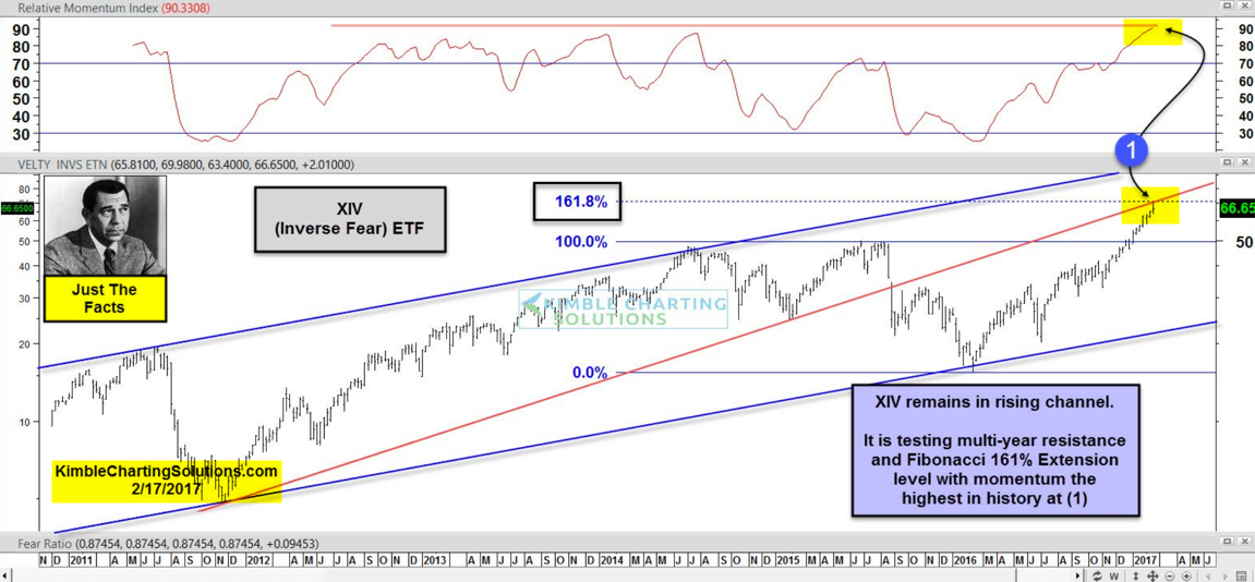 |
| Courtesy of Kimble Charting Solutions |
Keep following JustSignals using Twitter, @StockTwits or Follow By Email. Just submit your email address in the box on the Blog homepage. This has been posted for Educational Purposes Only. Do your own work and consult with Professionals before making any investment decisions. Past performance is not indicative of future results
Chaikin Charts: DIA, SPY, QQQ, IWM, XIV
In a few of the following charts, DIA SPY QQQ IWM, there is one thing common.
They are all in the OverBought area.
The type of high and reversal on the XIV is unique. Hopefully some of the following from Invesopedia and StockCharts.com are helpful.


 Keep following JustSignals using Twitter, @StockTwits or Follow By Email. Just submit your email address in the box on the Blog homepage. This
has been posted for Educational Purposes Only. Do your own work and
consult with Professionals before making any investment decisions. Past performance is not indicative of future results
Keep following JustSignals using Twitter, @StockTwits or Follow By Email. Just submit your email address in the box on the Blog homepage. This
has been posted for Educational Purposes Only. Do your own work and
consult with Professionals before making any investment decisions. Past performance is not indicative of future results
They are all in the OverBought area.
 |
| Courtesy of ChaikinAnalytics.com |
 |
| Courtesy of ChaikinAnalytics.com |
 | ||
| Courtesy of ChaikinAnalytics.com |
 |
| Courtesy of ChaikinAnalytics.com |


Wednesday, February 8, 2017
Picasso Cycle Dates
In this update only the dates will be mentioned with an "H" for high and a "L" for low.
The chart amplitude can and will be misleading at times.
In addition, it is the date that is most important rather than if that date is a projected high or low with amplitude as sometimes shown on the chart, not shown.
One important reason is because in some cases a date may invert and the amplitude and the "H" or "L" may not mean anything.
A low may actually turn out to be a high and visa versa.
Also it is very important that other tools always be used to confirm any potential ST Cycle Date.
Picasso Dates, always +/-
Jan 17-26 H
Feb 1 L
Feb 5 H - was not included in the last post
Feb 9 L
Feb 13 H
Feb 16-28 L & potential some sideways chop
Comments
The Jan 26 H turned out to be a high and Jan 31 turned out to be a low and only one day off the Feb 1 L Picasso date. Feb 5 H, was not included in the last post, but, so far highs on Feb 3 & Feb 7 straddled this Picasso date.
Long term indicators appear positive, so far. Negative divergence on many indicators have been broken very late last year and so they now suggest further upside. So, if small pullbacks develop into the Picasso cycle dates and daily indicators are OverSold, it may present a good buying opportunity.
In addition, LT cycles suggest a high April +/-, low August +/- & high November +/-. Always remember to confirm cycle dates with your or your professional investment advisors analysis.
Keep following JustSignals using Twitter, @StockTwits or Follow By Email. Just submit your email address in the box on the Blog homepage. This has been posted for Educational Purposes Only. Do your own work and consult with Professionals before making any investment decisions. Past performance is not indicative of future results
Friday, February 3, 2017
Compare 1929 & 1987 to 2017
 |
| Courtesy of @GordonTLong |
 |
| Courtesy of @JLyonsFundMgmt |
Only time, noted here, that it did not work was in 1987.
Keep following JustSignals using Twitter, @StockTwits or Follow By Email.
Just submit your email address in the box on the Blog homepage
This has been posted for Educational Purposes Only. Do your own work and consult with Professionals before making any investment decisions.
Past performance is not indicative of future results
Just submit your email address in the box on the Blog homepage
This has been posted for Educational Purposes Only. Do your own work and consult with Professionals before making any investment decisions.
Past performance is not indicative of future results
chart: SPY & REI by Tom DeMark

Keep following JustSignals using Twitter, @StockTwits or Follow By Email.
Just submit your email address in the box on the Blog homepage
This has been posted for Educational Purposes Only. Do your own work and consult with Professionals before making any investment decisions.
Past performance is not indicative of future results
Just submit your email address in the box on the Blog homepage
This has been posted for Educational Purposes Only. Do your own work and consult with Professionals before making any investment decisions.
Past performance is not indicative of future results
SuperBowl Indicator
Wikipedia
The Super Bowl Indicator is a superstition that says that the stock market's performance in a given year can be predicted based on the outcome of the Super Bowl of that year. It was "discovered" by Leonard Koppett in the '70s when he realized that it had never been wrong, until that point. This pseudo-macroeconomic concept states that if a team from the American Football Conference (AFC) wins, then it will be a bear market (or down market), but if a team from the National Football Conference (NFC) or a team that was in the NFL before the NFL/AFL merger it will be a bull market (up market).
 Accuracy
As of January 2017, the indicator has been correct 40 out of 50 times, as measured by the S&P 500 Index – a success rate of 80%.[1][2] However, since a particular football league winning a Super Bowl and the US Stock market have no real connection this is just a coincidence. Therefore, there is no reason to expect it will work as a predictor of future bull markets.[3]
The Super Bowl has done it again.
As illogical as it sounds, for seven years in a row the outcome of the game has foretold the stock market’s direction for the year. Overall, this now has happened after 40 of the 49 Super Bowls, for an 82% completion rate.
Up or down, it is a phenomenon known as the Super Bowl Predictor,
and some say its longtime guardian, who is nearly 90 years old (four
decades older than the Super Bowl itself), should be in the Hall of Fame
by now, either of investing or football.
Wall Street analyst Robert H. Stovall actually is the first to admit that the Predictor has no scientific basis. Still, academics have studied it. And Wall Street has a tradition of quirky indicators, perhaps because serious indicators fail so often.
“There is no intellectual backing for this sort of thing,” Mr. Stovall says of the Predictor, “except that it works.”
Here is what Predictor fans watch for: A win by an original National Football League team—from the days when there was an NFL and an American Football League, before the 1966 merger pact—means the market will be up for the year. A win by a descendant of the AFL sends the market down. Teams created since the merger count for their conference, National or American. (It helps that Pittsburgh, though in the American conference, is an original NFL team, since it has won six times in “up” years.)
It worked again in 2015 as an old AFL team, the New England Patriots, won and the Dow Jones Industrial Average fell 2.2% for the year. The last time the indicator fumbled was 2008 (the New York Giants won, but stocks slid).
 With NFL playoffs in full swing, the teams that would signal an “up”
2016 if they win it all are Carolina, Arizona, Seattle, Green Bay and
Pittsburgh. Bearish teams are those Patriots again, plus Denver and
Kansas City.
With NFL playoffs in full swing, the teams that would signal an “up”
2016 if they win it all are Carolina, Arizona, Seattle, Green Bay and
Pittsburgh. Bearish teams are those Patriots again, plus Denver and
Kansas City.

Mr. Stovall credits a New York Times sportswriter, the late Leonard
Koppett, for planting the idea for this “statistical Frankenstein.” Mr.
Stovall once marveled that when he was giving serious talks to investors
in the 1990s, “that’s what they want to know about.”
For Mr. Stovall, the Predictor has been a sidelight in a long Wall Street life. The Wharton graduate began his career in the 1950s when Elvis Presley was just starting to record. “I got a job as a morning newswire editor at E.F. Hutton & Co., a nice firm at 61 Broadway,” he says, “Mr. Hutton was still alive. I would show up early and write a newsletter picking the major headlines from whatever publications we could get.”
If that sounds like tweeting before computers, he also helped to break ground in financial TV as a regular on “Wall Street Week.” As his 90th birthday approaches, nine days after the Super Bowl on Feb. 7, he is still at work for National Investment Services in Tampa, Fla.
He isn’t rooting for a team, but he hopes stocks rise in 2016. A presidential election is “a fairly good background for some bullishness,” he says. “People are always hopeful that the next one will be better than the one before.”
 He says he doubts that his son Sam Stovall, who is S&P Capital
IQ’s U.S. equity strategist, will be interested in taking over the
Predictor. Too coincidental an indicator, after all.
But the
younger Mr. Stovall, 60, says he might surprise his dad and take the
handoff. True, the Predictor is “correlation without causation,” he
says, but “I think what Pop did is tremendous. He is the one who
popularized it.”
He says he doubts that his son Sam Stovall, who is S&P Capital
IQ’s U.S. equity strategist, will be interested in taking over the
Predictor. Too coincidental an indicator, after all.
But the
younger Mr. Stovall, 60, says he might surprise his dad and take the
handoff. True, the Predictor is “correlation without causation,” he
says, but “I think what Pop did is tremendous. He is the one who
popularized it.”
Mr. Power is a Wall Street Journal news editor. Email him at william.power@wsj.com.
The Super Bowl Indicator is a superstition that says that the stock market's performance in a given year can be predicted based on the outcome of the Super Bowl of that year. It was "discovered" by Leonard Koppett in the '70s when he realized that it had never been wrong, until that point. This pseudo-macroeconomic concept states that if a team from the American Football Conference (AFC) wins, then it will be a bear market (or down market), but if a team from the National Football Conference (NFC) or a team that was in the NFL before the NFL/AFL merger it will be a bull market (up market).

As of January 2017, the indicator has been correct 40 out of 50 times, as measured by the S&P 500 Index – a success rate of 80%.[1][2] However, since a particular football league winning a Super Bowl and the US Stock market have no real connection this is just a coincidence. Therefore, there is no reason to expect it will work as a predictor of future bull markets.[3]
The Super Bowl has done it again.
As illogical as it sounds, for seven years in a row the outcome of the game has foretold the stock market’s direction for the year. Overall, this now has happened after 40 of the 49 Super Bowls, for an 82% completion rate.
Wall Street analyst Robert H. Stovall actually is the first to admit that the Predictor has no scientific basis. Still, academics have studied it. And Wall Street has a tradition of quirky indicators, perhaps because serious indicators fail so often.
“There is no intellectual backing for this sort of thing,” Mr. Stovall says of the Predictor, “except that it works.”
Here is what Predictor fans watch for: A win by an original National Football League team—from the days when there was an NFL and an American Football League, before the 1966 merger pact—means the market will be up for the year. A win by a descendant of the AFL sends the market down. Teams created since the merger count for their conference, National or American. (It helps that Pittsburgh, though in the American conference, is an original NFL team, since it has won six times in “up” years.)
It worked again in 2015 as an old AFL team, the New England Patriots, won and the Dow Jones Industrial Average fell 2.2% for the year. The last time the indicator fumbled was 2008 (the New York Giants won, but stocks slid).

The Super Bowl as an investing tool? WSJ's Bill Power joins
Lunch Break with Tanya Rivero and discusses how the winner of the Super
Bowl has foretold the year's stock market performance for seven
consecutive years. Photo: Getty

Robert Stovall, above,
says one of his Penn Class of 1948 classmates was an actual football
legend, Chuck Bednarik of Philadelphia Eagles fame. ‘Powerful guy,’
recalls Stovall. ‘You’d walk behind him and his arms were so long his
hands would go below his knees. A pleasant fellow.’
Illustration:
Julie Teninbaum
For Mr. Stovall, the Predictor has been a sidelight in a long Wall Street life. The Wharton graduate began his career in the 1950s when Elvis Presley was just starting to record. “I got a job as a morning newswire editor at E.F. Hutton & Co., a nice firm at 61 Broadway,” he says, “Mr. Hutton was still alive. I would show up early and write a newsletter picking the major headlines from whatever publications we could get.”
If that sounds like tweeting before computers, he also helped to break ground in financial TV as a regular on “Wall Street Week.” As his 90th birthday approaches, nine days after the Super Bowl on Feb. 7, he is still at work for National Investment Services in Tampa, Fla.
He isn’t rooting for a team, but he hopes stocks rise in 2016. A presidential election is “a fairly good background for some bullishness,” he says. “People are always hopeful that the next one will be better than the one before.”

Mr. Power is a Wall Street Journal news editor. Email him at william.power@wsj.com.
Keep following JustSignals using Twitter, @StockTwits or Follow By Email.
Just submit your email address in the box on the Blog homepage
This has been posted for Educational Purposes Only. Do your own work and consult with Professionals before making any investment decisions.
Past performance is not indicative of future results
Just submit your email address in the box on the Blog homepage
This has been posted for Educational Purposes Only. Do your own work and consult with Professionals before making any investment decisions.
Past performance is not indicative of future results
Wednesday, February 1, 2017
Trading Patterns & First Day Gains
Today is February 1st and the first
trading day of the new month. The following post was last made on April 27,2016 & December 1, 2016, so now is a good time for a refresher on this subject.
* Take a look at the 3rd chart below by JEFFREY A. HIRSCH, editor-in-chief of the Stock Trader's Almanac. The data shows that the month of May has had the largest total DJIA points gained on the first day of the month from September 1997 to December 2012.
Browsing the Fidelity Customer Service Learning Center can be very useful
Monthly trading patterns: Human behavior shapes market activity
By Jeffrey A. Hirsch
www.stocktradersalmanac.com
Click on the following link for the full article
http://bit.ly/1HbpM7W
The following is an excerpt from the article
Monthly cash inflows into S&P stocks
Note that September 1997 through October 2000 racked up a total gain of 2632.39 Dow points on the first trading days of these 38 months (winners except for seven occasions). But between November 2000 and September 2002, when the 2000-2002 bear markets did the bulk of their damage, frightened investors switched from pouring money into the market on that day to pulling it out in fourteen months out of twenty-three. This netted a 404.80 Dow point loss. The 2007-2009 bear market lopped off 964.14 Dow points on first days in 17 months from November 2007 to March 2009. First days had their worst year in 2011, declining seven times for a total loss of 644.45 Dow points.
First days of June have performed worst. Triple digit declines in four of the last five years have resulted in the worst net loss. August is the second net loser. In rising market trends, first days perform much better as institutions are likely anticipating strong performance at each month’s outset. S&P 500 first days track the Dow’s pattern closely but NASDAQ first days are not as strong with weakness in April, August, and October.
* Take a look at the 3rd chart below by JEFFREY A. HIRSCH, editor-in-chief of the Stock Trader's Almanac. The data shows that the month of May has had the largest total DJIA points gained on the first day of the month from September 1997 to December 2012.
Browsing the Fidelity Customer Service Learning Center can be very useful
Monthly trading patterns: Human behavior shapes market activity
By Jeffrey A. Hirsch
www.stocktradersalmanac.com
Click on the following link for the full article
http://bit.ly/1HbpM7W
The following is an excerpt from the article
Monthly cash inflows into S&P stocks
For many years, the last trading day of the month plus the first four of the following month were the best market days of the month. This pattern is shown in Figure 1, where from 1953-1981 the S&P 500 shows these five consecutive trading days posting gains a much larger percentage of the time than the other 16 trading days of the average month. The rationale was that individuals and institutions tended to operate similarly, causing a massive flow of cash into stocks near beginnings of months.
|
| Courtesy of Jeffrey A. Hirsch |
“Front-running” traders took advantage of this phenomenon, drastically altering the previous pattern. Figure 2, which follows the S&P 500 from 1982 onward, shows the trading shift caused by these “anticipators” to the last three trading days of the month plus the first two. Another astonishing development shows the ninth, tenth, and eleventh trading days rising strongly as well. One possible explanation is that this mid-month bulge is caused by the enormous growth of 401(k) retirement plans (participants’ salaries are usually paid twice monthly).
Courtesy of Jeffrey A. Hirsch
------- > > > DJIA gains more on first day than all other days
Over the last 15 1/4 years the Dow Jones Industrial Average has gained more points on the first trading days of all months than all other days combined. While the Dow has gained 5481.72 points between September 2, 1997 (7622.42) and December 31, 2012 (13104.14), 5323.19 points were gained on the first trading days of these 184 months. The remaining 3674 trading days combined gained just 158.53 points during the period. This averages out to gains of 28.93 points on first days, in contrast to only 0.04 points on all others. See Table 1.Note that September 1997 through October 2000 racked up a total gain of 2632.39 Dow points on the first trading days of these 38 months (winners except for seven occasions). But between November 2000 and September 2002, when the 2000-2002 bear markets did the bulk of their damage, frightened investors switched from pouring money into the market on that day to pulling it out in fourteen months out of twenty-three. This netted a 404.80 Dow point loss. The 2007-2009 bear market lopped off 964.14 Dow points on first days in 17 months from November 2007 to March 2009. First days had their worst year in 2011, declining seven times for a total loss of 644.45 Dow points.
First days of June have performed worst. Triple digit declines in four of the last five years have resulted in the worst net loss. August is the second net loser. In rising market trends, first days perform much better as institutions are likely anticipating strong performance at each month’s outset. S&P 500 first days track the Dow’s pattern closely but NASDAQ first days are not as strong with weakness in April, August, and October.
Courtesy of Jeffrey A. Hirsch
For more information contact
JEFFREY A. HIRSCH, editor-in-chief of the Stock Trader's Almanac and Almanac Investor newsletter, and the author of The Little Book of Stock Market Cycles (Wiley, 2012).
www.stocktradersalmanac.com
Keep following JustSignals using Twitter, @StockTwits or Follow By Email.
Just submit your email address in the box on the Blog homepage
This
has been posted for Educational Purposes Only. Do your own work and
consult with Professionals before making any investment decisions.
Past performance is not indicative of future results
Subscribe to:
Posts (Atom)