The Short Term Picasso Cycle is not yet in sync with the stock market so only the Long Term Picasso Cycle will be discussed at this time.
Long term
As previously discussed, the
LT cycles suggested
a high in late November/early December and this suggested high on the LT
Cycles chart kept shifting forward until it stopped dead on Jan. 17,2018.
Shortly thereafter, the stock market slide 10%+/-.
-Looking out into 2018 the Picasso LT cycles still suggest a mid year low, BUT, the mid year low is now shifting forward with the addition of new daily and weekly data. It currently is suggesting a low in late July/early August.
-This also
coincides with the four year Presidential cycle (2017-2020) where there
is usually a low in the second year, (2nd yr is 2018), and a high in the
third year, (3rd yr is 2019). It is widely known that the mid-term years
are the best years for the stock market.
***Keep in mind that nothing
works 100% of the time!
The "key" is to be able to recognize when the second year low is in and when the third year high is in.
This will be watched carefully and an update will be made when the charts and cycles suggest that a bottom has been made.
Keep following JustSignals using Twitter, @StockTwits or Follow By Email. Just submit your email address in the box on the Blog homepage.
This
has been posted for Educational Purposes Only.
Do your own work and
consult with Professionals before making any investment decisions.
Past performance is not indicative of future results.
Thursday, July 5, 2018
chrts: SPY IWM
 |
| courtesy of ChaikinAnalytics.com |
 |
| courtesy of ChaikinAnalytics.com |
Also the Relative Strength of IWM is stronger than the Relative Strength of SPY. This can be seen in the Relative Strength bar being either red or green.
Keep following JustSignals using Twitter, @StockTwits or Follow By Email. Just submit your email address in the box on the Blog homepage.
This has been posted for Educational Purposes Only.
Do your own work and consult with Professionals before making any investment decisions.
Past performance is not indicative of future results.
Friday, June 15, 2018
charts: DIA SPY QQQ IWM
 |
| Courtesy of ChaikinAnalytics.com |
 |
| Courtesy of ChaikinAnalytics.com |
 |
| Courtesy of ChaikinAnalytics.com |
 |
| Courtesy of ChaikinAnalytics.com |
Note that each chart is Overbought indicted by the red circle.
Also the Relative Strength of IWM and QQQ is stronger than the Relative Strength of DIA and SPY. This can be seen in the Relative Strength bar being either red or green.
Keep following JustSignals using Twitter, @StockTwits or Follow By Email. Just submit your email address in the box on the Blog homepage.
This has been posted for Educational Purposes Only.
Do your own work and consult with Professionals before making any investment decisions.
Past performance is not indicative of future results.
Wednesday, May 16, 2018
charts: Picasso Cycle Update
In this update only the date/s will be mentioned with an "H" for high and a "L" for low.
The chart amplitude can and will be misleading at times.
In addition, it is the date/s that is most important rather than if that date is a projected high or low.
One important reason is because in some cases a date may invert and the "H" or "L" may not mean anything.
A low may actually turn out to be a high and visa versa.
Also it is very important that other tools always be used to confirm any potential ST Cycle Date.
Picasso Dates, always +/- --->Today the dates are being replaced with a chart

Note that in both the DIA & SPY charts above price is below the moving average and below the upper trading band. Also the Overbought/Oversold indicator is Overbought and the Relative Strength is weak. This comes at a time when the Picasso ST Cycles "suggests" a high this weekend. Please read the notes on the cycles chart to better understand how to read it.
In addition, note that the Cycles chart called the last low and rally since that low.
Comments:
Long term indicators appear positive, so far and the ADL just made another new ATH. The LT cycles suggested a low in August +/-, which we had, & a high in late November/early December and this suggested highon the LT Cycles chart kept moving forward until it stopped dead on Jan. 17,2018. Shortly thereafter, the stock market slide 10%+/-.
-Looking out into 2018 the Picasso LT cycles still suggest a mid year low.
-This also coincides with the four year Presidential cycle (2017-2020) where there is usually a low in the second year, (2nd yr is 2018), and a high in the third year, (3rd yr is 2019). It is widely known that the mid-term years are the best years for the stock market.
***Keep in mind that nothing works 100% of the time!
The "key" is to be able to recognize when the second year low is in and when the third year high is in.
Keep following JustSignals using Twitter, @StockTwits or Follow By Email. Just submit your email address in the box on the Blog homepage.
This has been posted for Educational Purposes Only.
Do your own work and consult with Professionals before making any investment decisions.
Past performance is not indicative of future results.
The chart amplitude can and will be misleading at times.
In addition, it is the date/s that is most important rather than if that date is a projected high or low.
One important reason is because in some cases a date may invert and the "H" or "L" may not mean anything.
A low may actually turn out to be a high and visa versa.
Also it is very important that other tools always be used to confirm any potential ST Cycle Date.
Picasso Dates, always +/- --->Today the dates are being replaced with a chart

 |
| Courtesy of ChaikinAnalytics.com |
 |
| Courtesy of ChaikinAnalytics.com |
In addition, note that the Cycles chart called the last low and rally since that low.
Comments:
Long term indicators appear positive, so far and the ADL just made another new ATH. The LT cycles suggested a low in August +/-, which we had, & a high in late November/early December and this suggested highon the LT Cycles chart kept moving forward until it stopped dead on Jan. 17,2018. Shortly thereafter, the stock market slide 10%+/-.
-Looking out into 2018 the Picasso LT cycles still suggest a mid year low.
-This also coincides with the four year Presidential cycle (2017-2020) where there is usually a low in the second year, (2nd yr is 2018), and a high in the third year, (3rd yr is 2019). It is widely known that the mid-term years are the best years for the stock market.
***Keep in mind that nothing works 100% of the time!
The "key" is to be able to recognize when the second year low is in and when the third year high is in.
Keep following JustSignals using Twitter, @StockTwits or Follow By Email. Just submit your email address in the box on the Blog homepage.
This has been posted for Educational Purposes Only.
Do your own work and consult with Professionals before making any investment decisions.
Past performance is not indicative of future results.
Monday, April 2, 2018
charts: What is SMART Money Doing?
Click on the following link (or copy and paste it in the URL line) for the full article and charts
https://bit.ly/2GtC4Dp
The 'SMART' Money Is Dumping Stocks As BTFD Officially Ends
Professional money managers were leery about buying stocks during the recent rebound, judging from Bloomberg's Smart Money Flow Index, which tracks Dow Jones Industrial Average moves in the first and final 30 minutes of trading.

The last time SMART money and the market diverged this much did not end well for stocks...

Keep following JustSignals using Twitter, @StockTwits or Follow By Email. Just submit your email address in the box on the Blog homepage.
This has been posted for Educational Purposes Only.
Do your own work and consult with Professionals before making any investment decisions.
Past performance is not indicative of future results.
This has been posted for Educational Purposes Only.
Do your own work and consult with Professionals before making any investment decisions.
Past performance is not indicative of future results.
chart: Nasdaq
By Danny
LunaticTrader
LunaticTrader
Markets
are going through another significant downswing. Volatility has been
high compared to what traders got used to in 2017. This was of course
inevitable, and it is something I was watching as an indication that we
are getting into the late stages of a multi-year bear market. See: Updated long term scenarios and charts.
So, what's next? Here is the current Nasdaq chart:
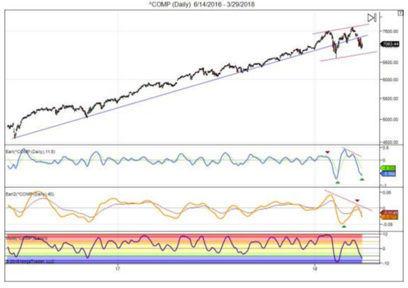 |
| Courtesy of LunaticTrader |
The
long term blue trend line in Nasdaq is clearly broken. But the Nasdaq
is still in a higher highs and higher lows sequence, so it's too early
to declare the end of the bull market in this index.
The Earl (blue line) is turning up from a major low. The slower Earl2 (orange line) is still dropping fast, but well into bottom territory. The MoM indicator has fallen into the blue pessimistic zone (<-5), where major buying opportunities are usually found. Once the MoM turns back up we will have a nice setup to do some cautious buying here.
The Earl (blue line) is turning up from a major low. The slower Earl2 (orange line) is still dropping fast, but well into bottom territory. The MoM indicator has fallen into the blue pessimistic zone (<-5), where major buying opportunities are usually found. Once the MoM turns back up we will have a nice setup to do some cautious buying here.
If
major indexes drop below their February lows, then more bearish
scenarios would gain traction. That wouldn't rule out new record highs
later on, but it would probably push them further back in time.
Keep following JustSignals using Twitter, @StockTwits or Follow By Email. Just submit your email address in the box on the Blog homepage.
This has been posted for Educational Purposes Only.
Do your own work and consult with Professionals before making any investment decisions.
Past performance is not indicative of future results.
This has been posted for Educational Purposes Only.
Do your own work and consult with Professionals before making any investment decisions.
Past performance is not indicative of future results.
Friday, March 23, 2018
STIX stock market indicator
By www.marketvolume.com
STIX indicator is the short-term index measuring the portion of the advancing stocks in the total number of the stocks listed in a market index. The STIX indicator is used in technical analysis to reveal overbought and oversold level on the market (when applied to Exchanges) and market sectors (when applied to market indexes).
Description
The STIX (Short Term Index) was first time mentioned by Picton Davies in his "The Polymetric Report Stix Record Book" in 1985. It is based on comparison of the number of advancing and declining stocks.
Traditionally, STIX based on the Exponential Moving Average with 21-bar period setting applied to the advance decline issues ratio and it oscillates in the range from 0 to 100. On our index charts you may have custom EMA applied to the Advance/decline ratio.
Technical Analysis, Signals and Trading Systems
In technical analysis the STIX index is used to determine the overbought and oversold condition on Exchanges and on market sectors covered by indexes. According to the "Polymetric Report" when EMA with 21-bar period setting is used
Comments by JustSignals
At the close today, Friday March 23,2018, the STIX is "45"
Keep following JustSignals using Twitter, @StockTwits or Follow By Email. Just submit your email address in the box on the Blog homepage.
This has been posted for Educational Purposes Only.
Do your own work and consult with Professionals before making any investment decisions.
Past performance is not indicative of future results.
STIX indicator is the short-term index measuring the portion of the advancing stocks in the total number of the stocks listed in a market index. The STIX indicator is used in technical analysis to reveal overbought and oversold level on the market (when applied to Exchanges) and market sectors (when applied to market indexes).
Description
The STIX (Short Term Index) was first time mentioned by Picton Davies in his "The Polymetric Report Stix Record Book" in 1985. It is based on comparison of the number of advancing and declining stocks.
Traditionally, STIX based on the Exponential Moving Average with 21-bar period setting applied to the advance decline issues ratio and it oscillates in the range from 0 to 100. On our index charts you may have custom EMA applied to the Advance/decline ratio.
Technical Analysis, Signals and Trading Systems
In technical analysis the STIX index is used to determine the overbought and oversold condition on Exchanges and on market sectors covered by indexes. According to the "Polymetric Report" when EMA with 21-bar period setting is used
- Most of the time the STIX indicator moves in the rage between 42 and 58;
- When the STIX indicator drops below 42 level it could be an indication of oversold market and it could be used as a signal to buy (except it is ranging Bear Market);
- The market is considered overbought when the STIX indicator raises above 56 (unless it is a new Bull Market);
- The market is considered strongly overbought and a "Sell" signal could be generated when the STIX indicator moves above 58 level (again, unless it is a new Bull Market).
| Overbought / Oversold Condition | STIX(21) Values |
| Extremely Overbought | greater than 58 |
| Fairly Overbought | greater than 56 |
| Fairly Oversold | less than 45 |
| Extremely Oversold | less than 42 |
Comments by JustSignals
At the close today, Friday March 23,2018, the STIX is "45"
Keep following JustSignals using Twitter, @StockTwits or Follow By Email. Just submit your email address in the box on the Blog homepage.
This has been posted for Educational Purposes Only.
Do your own work and consult with Professionals before making any investment decisions.
Past performance is not indicative of future results.
Saturday, March 17, 2018
Update: Similarities 1929, 1987, 2018
Two posts have been made showing the similarities between 1929, 1987 & 2018.
They were posted on Feb. 21,2018 and March 5,2018.
Some similarities still appear in the DJIA daily charts as shown below.
A blue box highlights the TD (trading days) from the ATH to the lower high before the waterfall slide in 1929 & 1987. A blue box also is included in the 2018 chart that displays a similar price pattern, so far.
After the blue box in 1929 & 1987 the previous lows were broken and this led to a very bearish pattern. If the recent lows in 2018 get violated, watch out for a "possible" bearish price pattern.
This pattern has been playing out since Feb.21,2018 and should continue to be watched very carefully.
This is not a guarantee that it will occur again.
But it should be watched just in case.


Some similarities:
1- Since the ATH price trades below the moving average
2- The moving average has a negative slope
3- The histogram is negative
4- The TD in 1929 (28 TD) & 1987 (27 TD) are similar from the ATH to the lower high before the slide
5- The TD in 2018 is also very similar (30 TD)
* BUT, price in 2018 is still trading above the recent lows.
Price MUST hold above the recent lows in order to invalidate a bearish scenario.
Watch this chart carefully.
Keep following JustSignals using Twitter, @StockTwits or Follow By Email. Just submit your email address in the box on the Blog homepage.
This has been posted for Educational Purposes Only.
Do your own work and consult with Professionals before making any investment decisions.
Past performance is not indicative of future results.
Wednesday, March 7, 2018
CandleSticks in recent charts


In addition to the SPY daily chart above, below is a month NYSE chart and a monthly DJTA chart. Both suggest problems in the market.
 |
| Courtesy of Chris Kimble, @KimbleCharting |
 |
| Courtesy of Chris Kimble, @KimbleCharting |
Keep following JustSignals using Twitter, @StockTwits or Follow By Email. Just submit your email address in the box on the Blog homepage.
This has been posted for Educational Purposes Only.
Do your own work and consult with Professionals before making any investment decisions.
Past performance is not indicative of future results.
Tuesday, March 6, 2018
Goldman Warns...
Goldman Warns "A Corrective Process Has Begun" - Targets S&P 2,449
ZEROHEDGE
by
Tyler Durden
Mon, 03/05/2018 - 19:40
Link to full article and charts
http://bit.ly/2titdyh
The S&P 500 is rebounding miraculously off its 100-day moving-average in the face of global panic about President Trump's tariff proposals...
But Goldman Sachs' technical analysis team are worried and target a drop to 2,449 for the major US stock index.
The S&P started a corrective process at the late January highs
Keep following JustSignals using Twitter, @StockTwits or Follow By Email. Just submit your email address in the box on the Blog homepage.
This has been posted for Educational Purposes Only.
Do your own work and consult with Professionals before making any investment decisions.
Past performance is not indicative of future results.
Monday, March 5, 2018
Update: Similarities 1929, 1987, 2018
On February 21,2018 there is a post - charts: Similarities, 1929, 1987, 2018
Since the post on Feb 21st the 3 periods are still very similar.
Today the stock market rallied about 1.37% in the DJIA
So it required a look back at 1929 & 1987 to see if those periods experienced any big rally days from the ATH made and before the waterfall slide into the crash day.
Before reading the data below, it would be insightful to first take a look at the charts in the February 21st post.
If you need it, here is the link
https://justsignals.blogspot.com/2018/02/charts-similarities-1929-1987-2018.html
So, now look at the findings below.
1987
Between the high on 8/25/1987 and the lower high on 10/2/1987, before the water fall slide into the crash day, there were several big rally days just like the one we had today and some bigger.
8/31/87 +0.89%
9/10/87 +1.05%
9/11/87 +1.27%
9/22/87 +3.02% *To try and convince the Bulls that this is not a Bear market
9/28/87 +1.22%
10/1/87 +1.65% - The day before the lower high made on 10/2/87 and before the water fall slide into the crash day
After 10/2/87
10/13/87 +1.49%
Then:
10/14/87 -3.81%
10/15/87 -2.39%
10/16/87 -4.60%
10/19/87 -22.61% Black Monday
1929
Between the high on 9/3/1929 and the lower high on 10/11/1929, before the water fall slide into the crash day, there were several big rally days just like the one we had today and some bigger.
9/6/29 +1.76%
9/11/29 +0.98%
9/16/29 +1.50%
9/26/29 +0.94%
10/7/29 +6.30% *To try and convince the Bulls that this is not a Bear market
10/10/29 +1.79% - The day before the lower high made on 10/2/87 and before the water fall slide
After 10/11/29
10/17/29 +1.73%
10/22/29 +1.75%
Then:
10/23/29 -6.31%
10/24/29 -2.09% Black Thursday with big intra-day low
10/25/29 +0.57%
10/28/29 -13.48%
10/29/29 -11.70% Black Tuesday
Comments
8/25/87 to 10/2/87 is 27 TD (trading days)
9/3/29 to 10/11/29 is 28 TD
"IF" 2018 is similar to 1929 & 1987, and it may be and it may not be, then 28 TD from the ATH on 1/26/2018 is 3/8/2018. This date would represent "the lower high before the water fall slide into the crash day". So 3/8/2018 would compare to 10/2/1987 & 10/11/1929, "IF" and only "IF" the 2018 pattern continues to be similar to 1929 & 1987.
1-It may continue to be similar
2-It may only be a shallow correction and not a crash
3-It may stop it's similarity and do something else
Keep an eye on it!
Keep following JustSignals using Twitter, @StockTwits or Follow By Email. Just submit your email address in the box on the Blog homepage.
This has been posted for Educational Purposes Only.
Do your own work and consult with Professionals before making any investment decisions.
Past performance is not indicative of future results.
Sunday, February 25, 2018
charts: DIA & SPY
 |
| Courtesy Of ChaikinAnalytics.com |
 |
| Courtesy Of ChaikinAnalytics.com |
Watch this carefully for any changes.
Review the post on Feb 21,2018 - Similarities in 1929 & 1987 & 2018
Link:
https://justsignals.blogspot.com/2018/02/charts-similarities-1929-1987-2018.html
Just saying, to keep an eye on it... Just in case...
Keep following JustSignals using Twitter, @StockTwits or Follow By Email. Just submit your email address in the box on the Blog homepage.
This has been posted for Educational Purposes Only.
Do your own work and consult with Professionals before making any investment decisions.
Past performance is not indicative of future results.
Friday, February 23, 2018
charts: Is GLD ready to move?
In the charts below there is the monthly SPY / GLD ratio and a monthly GLD chart.
Sometimes the SPY / GLD ratio chart gives a heads up to a move in GLD.
Certain indicators are not needed for this chart so they were blacked out.
As you can see from the SPY / GLD Ratio chart, it does give a heads up when to be Risk On GLD and Risk Off GLD.
According to the top chart:
Risk Off SPY = Risk On GLD
Risk On SPY = Risk Off GLD
This is confirmed by the second chart of GLD.
Many are currently suggesting a potential multi year Gold breakout.
The SPY / GLD Ratio chart can help spot this if and when it happens.
Keep following JustSignals using Twitter, @StockTwits or Follow By Email. Just submit your email address in the box on the Blog homepage.
This has been posted for Educational Purposes Only.
Do your own work and consult with Professionals before making any investment decisions.
Past performance is not indicative of future results.
Sometimes the SPY / GLD ratio chart gives a heads up to a move in GLD.
Certain indicators are not needed for this chart so they were blacked out.
 | ||
| Monthly SPY / GLD Ratio |
 |
| Monthly GLD |
According to the top chart:
Risk Off SPY = Risk On GLD
Risk On SPY = Risk Off GLD
This is confirmed by the second chart of GLD.
Many are currently suggesting a potential multi year Gold breakout.
The SPY / GLD Ratio chart can help spot this if and when it happens.
Keep following JustSignals using Twitter, @StockTwits or Follow By Email. Just submit your email address in the box on the Blog homepage.
This has been posted for Educational Purposes Only.
Do your own work and consult with Professionals before making any investment decisions.
Past performance is not indicative of future results.
Wednesday, February 21, 2018
charts: Similarities, 1929, 1987, 2018
Below are charts showing 3 different time periods. 1929, 1987 & 2018.
The first group shows all periods in the approximate place in time where we are today.
The second group shows what happened afterwards in 1929 & 1987.
The third group shows the same charts but instead of on a Daily chart, a 2 day chart was used. Meaning that each price bar is a 2 day price bar.
Group One - up against resistance at the moving average (blue circle) after hitting ATH
Group Two - failed to get above and stay above the moving average
Group Three - (2 day price chart) MUST hold above the moving average (yellow highlight) so it does not follow the pattern of 1929 & 1987
Keep following JustSignals using Twitter, @StockTwits or Follow By Email. Just submit your email address in the box on the Blog homepage.
This has been posted for Educational Purposes Only.
Do your own work and consult with Professionals before making any investment decisions.
Past performance is not indicative of future results.
The first group shows all periods in the approximate place in time where we are today.
The second group shows what happened afterwards in 1929 & 1987.
The third group shows the same charts but instead of on a Daily chart, a 2 day chart was used. Meaning that each price bar is a 2 day price bar.
Group One - up against resistance at the moving average (blue circle) after hitting ATH
 |
| Courtesy of Worden Bros. |
 |
| Courtesy of Worden Bros. |
 |
| Courtesy of Worden Bros. |
 |
| Courtesy of Worden Bros. |
 |
| Courtesy of Worden Bros. |
Group Three - (2 day price chart) MUST hold above the moving average (yellow highlight) so it does not follow the pattern of 1929 & 1987
 |
| Courtesy of Worden Bros. |
 |
| Courtesy of Worden Bros. |
 |
| Courtesy of Worden Bros. |
Keep following JustSignals using Twitter, @StockTwits or Follow By Email. Just submit your email address in the box on the Blog homepage.
This has been posted for Educational Purposes Only.
Do your own work and consult with Professionals before making any investment decisions.
Past performance is not indicative of future results.
Tuesday, February 20, 2018
chart: SPY vs 5 day Adv Vol

The charts above are from 4/11/17 to 2/20/18.
When the 5 day Adv Vol spiked above 3100 (red line) the SPY started to go into a sideways chop. A few days later when the 5 day Adv Vol bottomed the SPY started to rally. It is possible, based on past patterns, that in a few days when the 5 Day Adv Vol bottoms, the SPY will rally again.
Keep following JustSignals using Twitter, @StockTwits or Follow By Email. Just submit your email address in the box on the Blog homepage.
This has been posted for Educational Purposes Only.
Do your own work and consult with Professionals before making any investment decisions.
Past performance is not indicative of future results.
Sunday, February 18, 2018
charts: Is the bottom in?
Two charts are worth showing and you come to your own conclusion.


Keep following JustSignals using Twitter, @StockTwits or Follow By Email. Just submit your email address in the box on the Blog homepage.
This has been posted for Educational Purposes Only.
Do your own work and consult with Professionals before making any investment decisions.
Past performance is not indicative of future results.
Thursday, February 8, 2018
Follow the Signs
If you have been following the posts in this blog for a while you will remember the Long Term Cycle dates of a low in August 2017 and a high in November/December 2017. As you will see in the following chart, the August low came on time, but, the November/December high was early.
If you go back and review a long term wall chart you will see that most of the time bottoms are more noticeable and quicker to occur than tops. Tops seem to take time to rollover. Big portfolio managers need time to unload large blocks of stock near tops a little at a time. While at bottoms they come in sometimes with a vengeance and they want to be on the train before it leaves the station.
So, in order to work with the Long Term Cycle dates it is best to follow your charts and indicators. This has been said here many many times. When the cycle dates appear, that is a good time to watch the charts for changes in trend. The following chart is a good example of this.

The blue arrow indicates where the shallow August low ended just around the cycle low date and the red arrow indicates where the rally ended after the cycle high date. ADX is also a very good indicator to use. If you want to find out more about the ADX indicator, goto StockCharts.com where they have a free school of definitions, explanations and formulas.
Keep following JustSignals using Twitter, @StockTwits or Follow By Email. Just submit your email address in the box on the Blog homepage.
This has been posted for Educational Purposes Only.
Do your own work and consult with Professionals before making any investment decisions.
Past performance is not indicative of future results.
Wednesday, February 7, 2018
Cam's Trifecta Buy Signal
Cam Hui, CFA @HumbleStudent


Risk on, or risk off? $SPX $SPY
Our Trifecta Bottom Spotting Model flashed a buy signal, but can #sentiment turn from complacent to washout in just 2 days?
Keep following JustSignals using Twitter, @StockTwits or Follow By Email. Just submit your email address in the box on the Blog homepage.
This has been posted for Educational Purposes Only.
Do your own work and consult with Professionals before making any investment decisions.
Past performance is not indicative of future results.
This has been posted for Educational Purposes Only.
Do your own work and consult with Professionals before making any investment decisions.
Past performance is not indicative of future results.
Thursday, February 1, 2018
Tax Cuts & the Stock Market
Two previous time periods had very similar price patterns in the stock market along with tax cuts. The following charts show those two periods and the similar price patterns in the stock market.


So far 2017 was a solid up year just like 1963 and 1985. With interest rates on the rise and the 10 Year Bond Yields pushing higher, we may get that long awaited 5-10% correction that we have not had for almost two years.
In addition the LT Picasso Cycles (Posted by JustSignals) have been suggesting a mid year low for 2018.
"So far" this all seems to fit.
Let's watch our indicators carefully for any changes in stock market trends.
If this scenario continues, then we may have a high in 2019, similar to the highs in Jan1966 and Aug1987, before the next big correction or bear market.
Keep following JustSignals using Twitter, @StockTwits or Follow By Email. Just submit your email address in the box on the Blog homepage.
This has been posted for Educational Purposes Only.
Do your own work and consult with Professionals before making any investment decisions.
Past performance is not indicative of future results.
Wednesday, January 24, 2018
S&P500 another 130% Says...
The last time the market was this overbought stocks rallied nearly another 130%, says technician
Published 16 Hours Ago
By CNBC
The stock market is its most overbought since Bill Clinton was president, but that may actually be a good thing.
The S&P 500's 14-month relative strength index (RSI) surpassed the 87 level for the first time in nearly 22 years, Ari Wald, head of technical analysis at Oppenheimer, told CNBC's "Trading Nation" on Monday. That's a level it has reached only 1 percent of the time since 1930 – the other periods in which the measure moved that high were in 1996, 1986 and 1955, three of the strongest bull markets in history.
"There's really two key takeaways," said Wald. "One, even when you got to those high RSI readings, it was still followed by above-average returns. Two, that RSI indicator peaked at least a year ahead of the market on all those occasions."
The RSI is a momentum indicator technicians use to measure whether a stock or asset is overbought or oversold during a specific period of time.
Wald dusted off the history books. In 1996, the RSI hit 87 in June – from there to the market peak, the S&P 500 rose 128 percent. A decade earlier, the RSI reached similar levels and the S&P 500 proceeded to gain roughly 50 percent through to the bull market's high.
Going further back, in 1955, the RSI peaked at 88 in July and gained around 15 percent through to the top of its bullish stretch.

The current bull market has run for nearly nine years and most analysts do not see an end in sight. It is the second-longest bull market in history, beaten only by the stretch from 1990 to 2000. Since a bottom in 2009, the S&P 500 has climbed roughly 320 percent. The 1990-2000 bull market rose 417 percent.
"Add it up using history as a guide, how we see it is these overbought conditions are arguing against the top and instead for a continuation of the bull market," said Wald. He credits "broad-based internal breadth, cyclical leadership, and strong credit" as the main contributors to the markets' strength.
Bill Baruch, president of Blue Line Futures, is also bullish on the S&P 500 even as the equities market trades at its highest level in history.
"The market is not correcting. The question is, where's the next 1 percent to 2 percent? I believe the next 1 percent to 2 percent is higher," Baruch told "Trading Nation" on Monday. "I don't imagine getting any sort of correction until after March."
Baruch targets 2,847 for the S&P 500 for 2018, roughly flat with Tuesday's trading levels. Counting from the beginning of the year, Baruch's target suggests a more than 6 percent gain for the S&P 500 in 2018.
Wall Street has already had a remarkable run to begin the year. The S&P 500 is up 6 percent, the Dow also 6 percent and the Nasdaq nearly 9 percent for the year to date. The consumer discretionary sector is the best performer of the S&P 500 so far this year, led by a more than 30 percent gain in Netflix shares, while the telecom and utilities sectors are the worst performers.
Keep following JustSignals using Twitter, @StockTwits or Follow By Email. Just submit your email address in the box on the Blog homepage.
This has been posted for Educational Purposes Only.
Do your own work and consult with Professionals before making any investment decisions.
Past performance is not indicative of future results.
Subscribe to:
Posts (Atom)