Monday, October 8, 2018

chart of JNK:TLH

Courtesy of StockCharts.com
The purpose of this chart is to see if High Yield Bonds are stronger or weaker than 10-20 Year Treasury Bonds.

High Yield Bonds tend to keep pace with the stock market index.

10-20 Year Treasury Bonds tend to be the flight to quality during times of stock market volatility.

According to this chart, High Yield Bonds, currently, show stronger relative strength than the 10-20 Year Treasury Bonds.

Will this eventually lead to higher prices in the stock market?

Keep following JustSignals using Twitter, @StockTwits or Follow By Email. Just submit your email address in the box on the Blog homepage
This has been posted for Educational Purposes Only.   
Do your own work and consult with Professionals before making any investment decisions.  
Past performance is not indicative of future results.

Monday, October 1, 2018

Picasso Cycle Update

The Short Term Picasso Cycle is still not yet in sync with the stock market where it can be useful.  So only the Long Term Picasso Cycle will be discussed at this time.

Long term
As previously discussed, the LT cycles suggested a high in late November/early December and this suggested high on the LT Cycles chart kept shifting forward until it stopped dead on Jan. 17,2018.  Shortly thereafter, the stock market slide 10%+/-.

-Looking out into 2018 the Picasso LT Cycle suggested a mid year lowThis Cycle low came in late June / early July.   The DJIA low at that time was marginally higher than the actual March low.   

The Cycle is shifting again and it is currently suggesting a high around now +/- and then a low in late November / early December.  After this suggested Cycle low it then suggests a high in March 2019.  This March 2019 high has been suggested for some time now.  So we need to give it time to develop.  If it changes as we get closer it will be noted here in a future post.
 
-This also coincides with the four year Presidential cycle (2017-2020) where there is usually a low in the second year, (2nd yr is 2018), and a high in the third year, (3rd yr is 2019).  It is widely known that the mid-term years are the best years for the stock market.  

***Keep in mind that nothing works 100% of the time!
The "key" is to be able to recognize when the second year low is in and when the third year high is in.   
This will be watched carefully and an update will be made when the charts and cycles suggest that a bottom has been confirmed. 

Keep following JustSignals using Twitter, @StockTwits or Follow By Email. Just submit your email address in the box on the Blog homepage
This has been posted for Educational Purposes Only.   
Do your own work and consult with Professionals before making any investment decisions.  
Past performance is not indicative of future results.

Thursday, September 27, 2018

Chart Updates: DIA SPY QQQ

Courtesy of ChaikinAnalytics.com
The Overbought/Oversold indicator is highlighted by the red arrows.  These charts appear to be somewhat overbought at this time.  The above charts are as of the close on Wednesday Sept. 26,2018.  These charts are nice and simple to read.

The following chart shows the relative strength of several Index ETF's as of 9/26/18
Courtesy of ChaikinAnalytics.com

Keep following JustSignals using Twitter, @StockTwits or Follow By Email. Just submit your email address in the box on the Blog homepage
This has been posted for Educational Purposes Only.   
Do your own work and consult with Professionals before making any investment decisions.  
Past performance is not indicative of future results.

Wednesday, September 12, 2018

Chart Updates: SLY QQQ IYT SPY IWM DIA

Courtesy of ChaikinAnalytics.com

The Overbought/Oversold indicator is highlighted by the green rrows.  These charts appear to be somewhat oversold at this time.  The above charts are as of the close on Tuesday Sept. 11,2018.  These charts are nice and simple to read.

The following chart shows the relative strength of several Index ETF's as of 9/11/18
Courtesy of ChaikinAnalytics.com

Keep following JustSignals using Twitter, @StockTwits or Follow By Email. Just submit your email address in the box on the Blog homepage
This has been posted for Educational Purposes Only.   
Do your own work and consult with Professionals before making any investment decisions.  
Past performance is not indicative of future results.


Wednesday, August 22, 2018

STIX Stock Market Indicator

STIX indicator is the short-term index measuring the portion of the advancing stocks in the total number of the stocks listed in a market index. The STIX indicator is used in technical analysis to reveal overbought and oversold level on the market (when applied to Exchanges) and market sectors (when applied to market indexes).

Description
The STIX (Short Term Index) was first time mentioned by Picton Davies in his "The Polymetric Report Stix Record Book" in 1985. It is based on comparison of the number of advancing and declining stocks.

Traditionally, STIX based on the Exponential Moving Average with 21-bar period setting applied to the advance decline issues ratio and it oscillates in the range from 0 to 100. On our index charts you may have custom EMA applied to the Advance/decline ratio.

Technical Analysis, Signals and Trading Systems
In technical analysis the STIX index is used to determine the overbought and oversold condition on Exchanges and on market sectors covered by indexes. According to the "Polymetric Report" when EMA with 21-bar period setting is used


  • Most of the time the STIX indicator moves in the rage between 42 and 58;
  • When the STIX indicator drops below 42 level it could be an indication of oversold market and it could be used as a signal to buy (except it is ranging Bear Market);
  • The market is considered overbought when the STIX indicator raises above 56 (unless it is a new Bull Market);
  • The market is considered strongly overbought and a "Sell" signal could be generated when the STIX indicator moves above 58 level (again, unless it is a new Bull Market).
In general the STIX readings could be put into the following overbought/oversold table (bear in mind that this is for the STIX with 21 bar period setting):

Overbought / Oversold ConditionSTIX(21) Values
Extremely Overboughtgreater than 58
Fairly Overboughtgreater than 56
Fairly Oversoldless than 45
Extremely Oversoldless than 42

Comments by JustSignals 
At the close, Tuesday August 21,2018, the STIX was "57.0"


Keep following JustSignals using Twitter, @StockTwits or Follow By Email. Just submit your email address in the box on the Blog homepage
This has been posted for Educational Purposes Only.   
Do your own work and consult with Professionals before making any investment decisions.  
Past performance is not indicative of future results.

Shooting Star Candle

Courtesy of eSignal
By Investopedia

BREAKING DOWN 'Shooting Star'
Shooting stars indicate potential price tops and reversals. The shooting star candle is most effective when it forms after a series of at least three or more consecutive rising candles with higher highs. As the price rises, buyers get impatient waiting for a pull back, and leap frog over one another to purchase shares. Eventually, the buying frenzy hits a peak as the last of the immediate buyers jump into the stock (or any financial instrument) in a greed-driven panic to mark the highest high of the preceding series of candles.

Psychology of Shooting Stars
The earlier buyers eventually begin to take profits, and short-sellers enter into the stock, causing an immediate price drop after hitting a new high. The candle closes with a wick or shadow that is at least twice the size of the body. The wick or shadow represents the buyers who are immediately under water as liquidity starts to dry up. This is the potential shooting star candle. The very next candle will confirm whether it is a shooting star or a continuation candle.

Keep following JustSignals using Twitter, @StockTwits or Follow By Email. Just submit your email address in the box on the Blog homepage
This has been posted for Educational Purposes Only.   
Do your own work and consult with Professionals before making any investment decisions.  
Past performance is not indicative of future results.

Tuesday, August 21, 2018

Chart Updates: QQQ IYT SPY IWM DIA

Courtesy of ChaikinAnalytics.com
The Overbought/Oversold indicator is highlighted by the red circle.  These charts appear to be somewhat mixed at this time.  These charts are simple to read.

Keep following JustSignals using Twitter, @StockTwits or Follow By Email. Just submit your email address in the box on the Blog homepage
This has been posted for Educational Purposes Only.   
Do your own work and consult with Professionals before making any investment decisions.  
Past performance is not indicative of future results.

Monday, August 20, 2018

Picasso Cycle Update

The Short Term Picasso Cycle is still not yet in sync with the stock market where it can be useful.  So only the Long Term Picasso Cycle will be discussed at this time.

Long term
As previously discussed, the LT cycles suggested a high in late November/early December and this suggested high on the LT Cycles chart kept shifting forward until it stopped dead on Jan. 17,2018.  Shortly thereafter, the stock market slide 10%+/-.

-Looking out into 2018 the Picasso LT cycles still suggest a mid year low, BUT, the mid year low is is still shifting forward with the addition of new daily and weekly data.  It currently is suggesting a low in late August/early September.  When the cycle low stops shifting forward, like it did in January2018, that should indicate that a shift in the overall markets is near or in.
 
-This also coincides with the four year Presidential cycle (2017-2020) where there is usually a low in the second year, (2nd yr is 2018), and a high in the third year, (3rd yr is 2019).  It is widely known that the mid-term years are the best years for the stock market.  

***Keep in mind that nothing works 100% of the time!
The "key" is to be able to recognize when the second year low is in and when the third year high is in.   
This will be watched carefully and an update will be made when the charts and cycles suggest that a bottom has been confirmed. 

Keep following JustSignals using Twitter, @StockTwits or Follow By Email. Just submit your email address in the box on the Blog homepage
This has been posted for Educational Purposes Only.   
Do your own work and consult with Professionals before making any investment decisions.  
Past performance is not indicative of future results.

Tuesday, August 7, 2018

Chart Updates: DIA SPY QQQ IWM

Courtesy of ChaikinAnalytics.com
Courtesy of ChaikinAnalytics.com 
The Oversold indicator is highlighted by the red circle.These charts are simple to read and easy to interpret.


Keep following JustSignals using Twitter, @StockTwits or Follow By Email. Just submit your email address in the box on the Blog homepage
This has been posted for Educational Purposes Only.   
Do your own work and consult with Professionals before making any investment decisions.  
Past performance is not indicative of future results.

Wednesday, August 1, 2018

So when might this Bull end?

This year, the 2nd year of the Presidential cycle, and the Decennial Cycle seem to be playing out according to their scripts.

This bull market, as we have been hearing over and over again, is long in the tooth.

So when might this bull end?   Below is a chart and some statistics that may offer some clues.

We have discussed the Presidential Cycle in past blog posts.  So lets get right to the 2nd year which is where we are right now, 2018.  From the low in the 2nd year to the high in the 3rd year there has been excellent gains over the past 100 years +/-.   Below is the data for you to review.

Courtesy of Stock Traders Almanac
As you can see the gains have been great. 

Another Cycle to look at in addition to the Presidential Cycle is the Decennial Cycle.
This cycle shows that  lows and or bottoms in the stock market have been made in the first half of the decade and highs and or tops have been made in the second half of the decade.
You can see this in the following chart.

Courtesy of SeasonalCharts.com

Putting these two Cycles together, one might suspect that stocks may go higher into 2019 and that some sort of correction may commence and end in 2021-2023.

Keep following JustSignals using Twitter, @StockTwits or Follow By Email. Just submit your email address in the box on the Blog homepage
This has been posted for Educational Purposes Only.   
Do your own work and consult with Professionals before making any investment decisions.  
Past performance is not indicative of future results.


Friday, July 27, 2018

STIX Stock Market Indicator

By   www.marketvolume.com

STIX indicator is the short-term index measuring the portion of the advancing stocks in the total number of the stocks listed in a market index. The STIX indicator is used in technical analysis to reveal overbought and oversold level on the market (when applied to Exchanges) and market sectors (when applied to market indexes).

Description
The STIX (Short Term Index) was first time mentioned by Picton Davies in his "The Polymetric Report Stix Record Book" in 1985. It is based on comparison of the number of advancing and declining stocks.

Traditionally, STIX based on the Exponential Moving Average with 21-bar period setting applied to the advance decline issues ratio and it oscillates in the range from 0 to 100. On our index charts you may have custom EMA applied to the Advance/decline ratio.

Technical Analysis, Signals and Trading Systems
In technical analysis the STIX index is used to determine the overbought and oversold condition on Exchanges and on market sectors covered by indexes. According to the "Polymetric Report" when EMA with 21-bar period setting is used

  • Most of the time the STIX indicator moves in the rage between 42 and 58;
  • When the STIX indicator drops below 42 level it could be an indication of oversold market and it could be used as a signal to buy (except it is ranging Bear Market);
  • The market is considered overbought when the STIX indicator raises above 56 (unless it is a new Bull Market);
  • The market is considered strongly overbought and a "Sell" signal could be generated when the STIX indicator moves above 58 level (again, unless it is a new Bull Market).
In general the STIX readings could be put into the following overbought/oversold table (bear in mind that this is for the STIX with 21 bar period setting):

Overbought / Oversold ConditionSTIX(21) Values
Extremely Overboughtgreater than 58
Fairly Overboughtgreater than 56
Fairly Oversoldless than 45
Extremely Oversoldless than 42

Comments by JustSignals 
At the close, Thursday July 26,2018, the STIX was "56.2"


Keep following JustSignals using Twitter, @StockTwits or Follow By Email. Just submit your email address in the box on the Blog homepage
This has been posted for Educational Purposes Only.   
Do your own work and consult with Professionals before making any investment decisions.  
Past performance is not indicative of future results.

Saturday, July 21, 2018

Chart Updates: SLY IWM QQQ MDY SPY DIA

Courtesy of ChaikinAnalytics.com

Courtesy of ChaikinAnalytics.com

Courtesy of ChaikinAnalytics.com

Courtesy of ChaikinAnalytics.com

Courtesy of ChaikinAnalytics.com

Courtesy of ChaikinAnalytics.com

Note that each chart is more Overbought than at the last post on July 14,2018.  The Overbought indicator is highlighted by the red circle.
Also the Chaikin Money flow of all the charts are weak.  As you can see, some weaker than others. 
Most CMF did not move up when the market moved up or they had a weak move up and failed to even reach the previous high.
This may turn out to be ominous in the short term.
In addition the DIA is still trading below it's moving average.


Keep following JustSignals using Twitter, @StockTwits or Follow By Email. Just submit your email address in the box on the Blog homepage
This has been posted for Educational Purposes Only.   
Do your own work and consult with Professionals before making any investment decisions.  
Past performance is not indicative of future results.


Saturday, July 14, 2018

charts: DIA SPY QQQ IWM

Courtesy of ChaikinAnalytics.com

Courtesy of ChaikinAnalytics.com

Courtesy of ChaikinAnalytics.com

Courtesy of ChaikinAnalytics.com

Note that each chart is at or near Overbought indicted by the red circle.
Also the Chaikin Money flow of all the charts are weak.  As you can see, some weaker than others. 
Most CMF did not move up when the market moved up or they had a weak move up and failed to even reach the previous high.
This may turn out to be ominous in the short term.
In addition the DIA is trading below it's moving average.


Keep following JustSignals using Twitter, @StockTwits or Follow By Email. Just submit your email address in the box on the Blog homepage
This has been posted for Educational Purposes Only.   
Do your own work and consult with Professionals before making any investment decisions.  
Past performance is not indicative of future results.

Thursday, July 5, 2018

Picasso Cycle Update

The Short Term Picasso Cycle is not yet in sync with the stock market so only the Long Term Picasso Cycle will be discussed at this time.


Long term
As previously discussed, the LT cycles suggested a high in late November/early December and this suggested high on the LT Cycles chart kept shifting forward until it stopped dead on Jan. 17,2018.  Shortly thereafter, the stock market slide 10%+/-.

-Looking out into 2018 the Picasso LT cycles still suggest a mid year low, BUT, the mid year low is now shifting forward with the addition of new daily and weekly data.  It currently is suggesting a low in late July/early August.
-This also coincides with the four year Presidential cycle (2017-2020) where there is usually a low in the second year, (2nd yr is 2018), and a high in the third year, (3rd yr is 2019).  It is widely known that the mid-term years are the best years for the stock market.  

***Keep in mind that nothing works 100% of the time!
The "key" is to be able to recognize when the second year low is in and when the third year high is in.   
This will be watched carefully and an update will be made when the charts and cycles suggest that a bottom has been made. 

Keep following JustSignals using Twitter, @StockTwits or Follow By Email. Just submit your email address in the box on the Blog homepage
This has been posted for Educational Purposes Only.   
Do your own work and consult with Professionals before making any investment decisions.  
Past performance is not indicative of future results.

chrts: SPY IWM

courtesy of ChaikinAnalytics.com

courtesy of ChaikinAnalytics.com
Note that each chart is Over Sold indicted by the red circle.
Also the Relative Strength of IWM is stronger than the Relative Strength of SPY.  This can be seen in the Relative Strength bar being either red or green.


Keep following JustSignals using Twitter, @StockTwits or Follow By Email. Just submit your email address in the box on the Blog homepage
This has been posted for Educational Purposes Only.   
Do your own work and consult with Professionals before making any investment decisions.  
Past performance is not indicative of future results.


Friday, June 15, 2018

charts: DIA SPY QQQ IWM

Courtesy of ChaikinAnalytics.com

Courtesy of ChaikinAnalytics.com

Courtesy of ChaikinAnalytics.com

Courtesy of ChaikinAnalytics.com

Note that each chart is Overbought indicted by the red circle.
Also the Relative Strength of IWM and QQQ is stronger than the Relative Strength of DIA and SPY.  This can be seen in the Relative Strength bar being either red or green.


Keep following JustSignals using Twitter, @StockTwits or Follow By Email. Just submit your email address in the box on the Blog homepage
This has been posted for Educational Purposes Only.   
Do your own work and consult with Professionals before making any investment decisions.  
Past performance is not indicative of future results.


Wednesday, May 16, 2018

charts: Picasso Cycle Update

In this update only the date/s will be mentioned with an "H" for high and a "L" for low.
The chart amplitude can and will be misleading at times.
In addition, it is the date/s that is most important rather than if that date is a projected high or low.
One important reason is because in some cases a date may invert and the "H" or "L" may not mean anything.
A low may actually turn out to be a high and visa versa.
Also it is very important that other tools always be used to confirm any potential ST Cycle Date. 

Picasso Dates, always +/-  --->Today the dates are being replaced with a chart   


Courtesy of ChaikinAnalytics.com
Note that in both the DIA & SPY charts above price is below the moving average and below the upper trading band.  Also the Overbought/Oversold indicator is Overbought and the Relative Strength is weak.  This comes at a time when the Picasso ST Cycles "suggests" a high this weekend.  Please read the notes on the cycles chart to better understand how to read it.  
In addition, note that the Cycles chart called the last low and rally since that low.

Comments:

Long term indicators appear positive, so far and the ADL just made another new ATH.   The LT cycles suggested a low in August +/-, which we had, & a high in late November/early December and this suggested highon the LT Cycles chart kept moving forward until it stopped dead on Jan. 17,2018.  Shortly thereafter, the stock market slide 10%+/-.
-Looking out into 2018 the Picasso LT cycles still suggest a mid year low.
-This also coincides with the four year Presidential cycle (2017-2020) where there is usually a low in the second year, (2nd yr is 2018), and a high in the third year, (3rd yr is 2019).  It is widely known that the mid-term years are the best years for the stock market.  
***Keep in mind that nothing works 100% of the time!
The "key" is to be able to recognize when the second year low is in and when the third year high is in. 


Keep following JustSignals using Twitter, @StockTwits or Follow By Email. Just submit your email address in the box on the Blog homepage
This has been posted for Educational Purposes Only.   
Do your own work and consult with Professionals before making any investment decisions.  
Past performance is not indicative of future results.

Monday, April 2, 2018

charts: What is SMART Money Doing?


Click on the following link (or copy and paste it in the URL line) for the full article and charts
https://bit.ly/2GtC4Dp

The 'SMART' Money Is Dumping Stocks As BTFD Officially Ends

Professional money managers were leery about buying stocks during the recent rebound, judging from Bloomberg's Smart Money Flow Index, which tracks Dow Jones Industrial Average moves in the first and final 30 minutes of trading.

The thinking is that smart money will test the market and wait until the end of the day before committing to any large moves.
The last time SMART money and the market diverged this much did not end well for stocks...


Keep following JustSignals using Twitter, @StockTwits or Follow By Email. Just submit your email address in the box on the Blog homepage
This has been posted for Educational Purposes Only.   
Do your own work and consult with Professionals before making any investment decisions.  
Past performance is not indicative of future results.

chart: Nasdaq

By Danny
LunaticTrader

Markets are going through another significant downswing. Volatility has been high compared to what traders got used to in 2017. This was of course inevitable, and it is something I was watching as an indication that we are getting into the late stages of a multi-year bear market. See: Updated long term scenarios and charts.
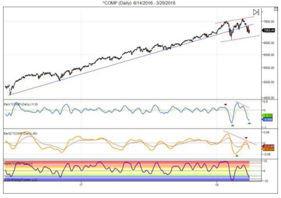
So, what's next? Here is the current Nasdaq chart:
Courtesy of LunaticTrader
 The long term blue trend line in Nasdaq is clearly broken. But the Nasdaq is still in a higher highs and higher lows sequence, so it's too early to declare the end of the bull market in this index.
The Earl (blue line) is turning up from a major low. The slower Earl2 (orange line) is still dropping fast, but well into bottom territory. The MoM indicator has fallen into the blue pessimistic zone (<-5), where major buying opportunities are usually found. Once the MoM turns back up we will have a nice setup to do some cautious buying here.
If major indexes drop below their February lows, then more bearish scenarios would gain traction. That wouldn't rule out new record highs later on, but it would probably push them further back in time. 
Keep following JustSignals using Twitter, @StockTwits or Follow By Email. Just submit your email address in the box on the Blog homepage
This has been posted for Educational Purposes Only.   
Do your own work and consult with Professionals before making any investment decisions.  
Past performance is not indicative of future results.