Tuesday, September 27, 2016

chart: Silver


Below looks at a chart on Silver, dating back to the early 1970’s. Silver created an important top at $50 in 1980, did it create another important top at the same price in 2011?
Courtesy of KimbleChartingSolutions.com

Silver hit $50 in 2011, which was the highs back in 1980 and since then, has created a series of lower highs and lower lows.
Silver is now testing a bunch of resistance lines and its Fibonacci 61% retracement level at (1), with bullish sentiment at lofty readings.
For Silver to break free from its trend of lower highs and lower lows, it needs to take out this “resistance bunch” to do so.
The Silver “Risk On” trade does not want to see selling take place below this key price zone at (1).

Keep following JustSignals using Twitter, @StockTwits or Follow By Email. Just submit your email address in the box on the Blog homepageThis has been posted for Educational Purposes Only.   Do your own work and consult with Professionals before making any investment decisions.  Past performance is not indicative of future results

Sunday, September 25, 2016

Picasso Cycle Dates Upddate

The following was posted on August 25,2016.
The Picasso Cycle Dates have been working very well recently.
The next group of Picasso Cycle Dates will be posted shortly.


In this update only the dates will be mentioned with an "H" for high and a "L" for low.
The chart amplitude can and will be misleading at times.
In addition, it is the date that is most important rather than if that date is a projected high or low with amplitude as sometimes shown on the chart.
One important reason is because in some cases a date may invert and the amplitude and the "H" or "L" may not mean anything.
A low may actually turn out to be a high and visa versa.
Also it is very important that other tools always be used to confirm any potential ST Cycle Date.

Picasso Dates, always +/-
8/31-9/3* H
9/17 L
9/20-26 H
10/5-9 L

* Note that 9/3 is an Anniversary Date of the 1929 high on 9/3/1929


Keep following JustSignals using Twitter, @StockTwits or Follow By Email. Just submit your email address in the box on the Blog homepageThis has been posted for Educational Purposes Only.   Do your own work and consult with Professionals before making any investment decisions.  Past performance is not indicative of future results

Tuesday, September 20, 2016

chart: SPY & Tom DeMark's REI

The following chart is the weekly SPY.  Below is the REI (range expansion index by Tom DeMark)


Weekly SPY
Green bars & Blue Circle - Over Sold and in an area where bottoms form

The Description
The DeMark Range Expansion Index is a market-timing oscillator described in DeMark on Day Trading Options, by T.R. DeMark and T.R. Demark, Jr., McGraw Hill, 1999. The oscillator is arithmetically calculated and is designed to overcome problems with exponentially calculated oscillators, like MACD. The TD REI oscillator typically produces values of -100 to +100 with 45 or higher indicating overbought conditions and -45 or lower indicating oversold. DeMark advises against trading in extreme overbought or oversold conditions indicated by six or more bars above or below the 45 thresholds. For more information on using TD REI the user is referred to the DeMark text.
 
Keep following JustSignals using Twitter, @StockTwits or Follow By Email. 
Just submit your email address in the box on the Blog homepage
This has been posted for Educational Purposes Only.   Do your own work and consult with Professionals before making any investment decisions.  
Past performance is not indicative of future results
 

Friday, September 16, 2016

charts: McClellan Osc Hi Yld Bd A-D & SP500

Chart In Focus, by Tom McClellan
McClellan Oscillator for High Yield Bond A-D Data

September 14, 2016

The regular McClellan Oscillator is based on Advance-Decline (A-D) data for the NYSE.  But the same calculation can be done on other sets of A-D data.  This week’s chart looks at an interesting example of that, with a big message for the current moment.
The Financial Industry Regulatory Authority (FINRA) kindly publishes data on Advances and Declines for corporate bonds, breaking out totals for Investment Grade, High Yield, and Convertible.  Each category is interesting in its own right, but I find the High Yield numbers the most interesting, perhaps because of the strong correlation that such bonds have to the movements of the stock market. 
This particular version of the McClellan Oscillator for High Yield Bonds is calculated the same way as for the NYSE A-D data.  But because the number of issues traded are different for each market, the raw scaling is therefore necessarily going to be different.  
Once we get past that notion of scaling, and just focus on the chart itself, we can pretty easily see where “high” and “low” readings are.  

 I drew a horizontal line at the arbitrarily chosen level of -75 to help focus the eye on the situation we see right now.  Very low readings below that line tend to reliably be associated with meaningful bottoms for the SP500 I should caution that the notion of “meaningful” bottoms does not mean the same thing as “final” bottoms. 
But such bottoms are usually followed by meaningful bounces, if not outright up moves.  That is the important message.  What we are seeing with this very low reading is a message that the stock market is at a meaningful bottom and ought to see a brief pop, at a minimum.  What happens after that is a more difficult question to address.

It is not only the McClellan Oscillator for these data which has merit.  A raw Advance-Decline Line (A-D Line) can have value on its own, when it signals a trend change. 

When the High Yield Corporate Bond A-D Line crosses through a long trendline, it is a pretty darned good signal of a trend change.  Some examples are shown in this second chart. 
This is important now because we have just seen such a crossing, this time below the rising bottoms line that dates back to the Feb. 2016 low.  That line has been fairly authoritatively broken, and now this A-D Line is also threatening to close below its own 5% Trend (AKA 39-day EMA), an act which would add further confirmation of a trend change. 
High yield bonds had come back into fashion in 2016, as the central banks’ policies of zero or negative interest rate policy has pushed investors into more risky assets.  The pendulum appears to be swinging back again, although it has swung really far already on the first push, as evidenced by the extremely negative McClellan Oscillator reading shown above.  That says the initial down leg may have gone too far too fast all at once.
But the broken uptrend lines says we are seeing a significant trend change getting started right now.  Both messages are worth acknowledging.
Tom McClellan
Editor, The McClellan Market Report
www.mcoscillator.com
(253) 581-4889 

Keep following JustSignals using Twitter, @StockTwits or Follow By Email. 
Just submit your email address in the box on the Blog homepage
This has been posted for Educational Purposes Only.   Do your own work and consult with Professionals before making any investment decisions.  
Past performance is not indicative of future results

Thursday, September 15, 2016

chart: SPY vs 10dma Highs-Lows


Notice that positive and negative divergences work pretty well.
Waiting for the next one...

Keep following JustSignals using Twitter, @StockTwits or Follow By Email. 
Just submit your email address in the box on the Blog homepage
This has been posted for Educational Purposes Only.   Do your own work and consult with Professionals before making any investment decisions.  
Past performance is not indicative of future results

Friday, September 9, 2016

chart: SPY 30min signals

Courtesy of TradeStation.com
The SPY 30min chart gave some great signals and is still on a sell at 3:15pm today.

Keep following JustSignals using Twitter, @StockTwits or Follow By Email. 
Just submit your email address in the box on the Blog homepage
This has been posted for Educational Purposes Only.   Do your own work and consult with Professionals before making any investment decisions.  
Past performance is not indicative of future results

chart: Storm Coming?

Courtesy of Bloomberg TV
On Sept 2,2016 this chart of the JPY/BGN Currency, was shown on Bloomberg TV.  The moving averages (MA) are the 12 month MA & the 24 month MA.   It suggests that when the 12 month MA crosses the 24 month MA some type of crisis occurs as noted in this chart.  The green arrow shows that another cross over has occurred again.  

Keep following JustSignals using Twitter, @StockTwits or Follow By Email. 
Just submit your email address in the box on the Blog homepage
This has been posted for Educational Purposes Only.   Do your own work and consult with Professionals before making any investment decisions.  
Past performance is not indicative of future results

Sunday, September 4, 2016

NIRP as a real FED option

For the full article go to the following link
http://finance.yahoo.com/news/feds-janet-yellen-mulls-negative-interest-rates-183711629.html


Keep following JustSignals using Twitter, @StockTwits or Follow By Email. 
Just submit your email address in the box on the Blog homepage
This has been posted for Educational Purposes Only.   Do your own work and consult with Professionals before making any investment decisions.  
Past performance is not indicative of future results


Monday, August 29, 2016

charts: September Stock Markets

Courtesy of thepatternsite.com
Possible Explanation By Investopedia
Since 1950, the month of September has seen an average decline in the Dow Jones Industrial Average (DJIA) of 1.1%, while the S&P 500 has averaged a 0.7% decline during September. Since the Nasdaq was first established in in 1971, its composite index has fallen an average of 1% during September trading. This is, of course, only an average exhibited over many years, and September is certainly not the worst month of stock-market trading every year.
There are several theories which attempt to explain this phenomenon. One particular theory points to the fact the summer months usually offer light trading volumes on the stock market, as a good deal of investors typically take vacation time and refrain from selling stocks from their portfolio. Once fall begins these investors typically return to work and exit positions they had been planning on selling. When this occurs, the market experiences increased selling pressure, and thus an overall decline.
*As well, many mutual funds experience their fiscal yearend in September. Mutual fund managers, on average, typically sell losing positions before year end, and this trend is another possible explanation for the market's poor performance during September.
Data from moneychimp.com
            Yrs  Yrs  Avg
Month  Up  Dn   Gain/Loss
Jan        39   26   +0.94%
Feb       37   28    -0.13%
Mar       42   23   +1.10%
Apr       44   21   +1.36%
May      37   28   +0.11%
Jun       33   32    -0.07%
Jul        35   30   +0.83%
Aug     37   28    -0.18%
Sep     29   36     -0.65%
Oct     40   25     +0.68%
Nov    43   22     +1.37%
Dec    49   16     +1.59%
The data above supports that September is the worst month of the year and that the best six months of the year is November to April.

Keep following JustSignals using Twitter, @StockTwits or Follow By Email. 
Just submit your email address in the box on the Blog homepage
This has been posted for Educational Purposes Only.   Do your own work and consult with Professionals before making any investment decisions.  
Past performance is not indicative of future results

1st Day of the Month Gains

DJIA gains more on first day than all other days 

Over the last 15 1/4 years the Dow Jones Industrial Average has gained more points on the first trading days of all months than all other days combined. While the Dow has gained 5481.72 points between September 2, 1997 (7622.42) and December 31, 2012 (13104.14), 5323.19 points were gained on the first trading days of these 184 months. The remaining 3674 trading days combined gained just 158.53 points during the period. This averages out to gains of 28.93 points on first days, in contrast to only 0.04 points on all others. See Table 1.

Note that September 1997 through October 2000 racked up a total gain of 2632.39 Dow points on the first trading days of these 38 months (winners except for seven occasions). But between November 2000 and September 2002, when the 2000-2002 bear markets did the bulk of their damage, frightened investors switched from pouring money into the market on that day to pulling it out in fourteen months out of twenty-three. This netted a 404.80 Dow point loss. The 2007-2009 bear market lopped off 964.14 Dow points on first days in 17 months from November 2007 to March 2009. First days had their worst year in 2011, declining seven times for a total loss of 644.45 Dow points.

First days of June have performed worst. Triple digit declines in four of the last five years have resulted in the worst net loss. August is the second net loser. In rising market trends, first days perform much better as institutions are likely anticipating strong performance at each month’s outset. S&P 500 first days track the Dow’s pattern closely but NASDAQ first days are not as strong with weakness in April, August, and October.

Courtesy of Jeffrey A. Hirsch
 For more information contact
 JEFFREY A. HIRSCH, editor-in-chief of the Stock Trader's Almanac and Almanac Investor newsletter, and the author of The Little Book of Stock Market Cycles (Wiley, 2012).
 www.stocktradersalmanac.com

Keep following JustSignals using Twitter, @StockTwits or Follow By Email. 
Just submit your email address in the box on the Blog homepage
This has been posted for Educational Purposes Only.   Do your own work and consult with Professionals before making any investment decisions.  
Past performance is not indicative of future results

Thursday, August 25, 2016

chart: SPY Buying Pressure Weakening

For those of you that have seen the Buying Pressure chart in the past you will see a pattern that repeats itself very often.  It tends to lead the market at turns.  For those of you that are not familiar with this chart, please look at past posts.

One easy way to find them is go to "Search This Blog" 
  Then enter "Buying Pressure"

This will get you a list of the posts and just click on them to review and get familiar with them.

Buying Pressure has started to have a negative divergence with the SPY daily chart.  Once this happens a caution light goes on.   Confirmations must follow before taking any actions.  Take a few minutes to go back and review some older posts.  It will be time worth spending and always wait for confirmations.

Keep following JustSignals using Twitter, @StockTwits or Follow By Email. 
Just submit your email address in the box on the Blog homepage
This has been posted for Educational Purposes Only.   Do your own work and consult with Professionals before making any investment decisions.  
Past performance is not indicative of future results

Picasso ST Cycle Dates

In this update only the dates will be mentioned with an "H" for high and a "L" for low.
The chart amplitude can and will be misleading at times.
In addition, it is the date that is most important rather than if that date is a projected high or low with amplitude as sometimes shown on the chart.
One important reason is because in some cases a date may invert and the amplitude and the "H" or "L" may not mean anything.
A low may actually turn out to be a high and visa versa.
Also it is very important that other tools always be used to confirm any potential ST Cycle Date.

Picasso Dates, always +/-
8/31-9/3* H
9/17 L
9/20-26 H
10/5-9 L

* Note that 9/3 is an Anniversary Date of the 1929 high on 9/3/1929


Keep following JustSignals using Twitter, @StockTwits or Follow By Email. Just submit your email address in the box on the Blog homepageThis has been posted for Educational Purposes Only.   Do your own work and consult with Professionals before making any investment decisions.  Past performance is not indicative of future results

Wednesday, August 24, 2016

chart: SPY & the Hi-Lo 10dma


The 10 Day Hi-Lo is flashing a caution light.  When the SPY makes a higher high while the 10 day Hi-Lo starts to drop, be on watch.  In the past divergences appear at most turns in the market.  At the very least, the 10 day Hi-Lo develops lower highs and lower lows at or near tops and higher highs and higher lows at or near bottoms.
This one down turn in the 10 day Hi-Lo is not by itself an indicator of a guaranteed turn, but, it is a warning that it should be carefully watched.

Buying Pressure has been falling also.   See the current post of Buying Pressure.

Keep following JustSignals using Twitter, @StockTwits or Follow By Email. 
Just submit your email address in the box on the Blog homepage
This has been posted for Educational Purposes Only.   Do your own work and consult with Professionals before making any investment decisions.  
Past performance is not indicative of future results

Tuesday, August 23, 2016

chart: SPY Buying Pressure


For those of you that have seen the Buying Pressure chart in the past you will see a pattern that repeats itself very often.  It tends to lead the market at turns.  For those of you that are not familiar with this chart, please look at past posts.

One easy way to find them is go to "Search This Blog" 
  Then enter "Buying Pressure"

This will get you a list of the posts and just click on them to review and get familiar with them.

Buying Pressure has started to have a negative divergence with the SPY daily chart.  Once this happens a caution light goes on.   Confirmations must follow before taking any actions.  Take a few minutes to go back and review some older posts.  It will be time worth spending and always wait for confirmations.

Keep following JustSignals using Twitter, @StockTwits or Follow By Email. 
Just submit your email address in the box on the Blog homepage
This has been posted for Educational Purposes Only.   Do your own work and consult with Professionals before making any investment decisions.  
Past performance is not indicative of future results

Friday, August 19, 2016

7th & 9th Years of the Decennial Pattern


The above charts start from 1915 and go to the current year 2016.
Each decade is shown separately.  As you can see the 7th and 9th years have been highlighted in yellow.
The reason for this was to show that highs have been made in the 7th and 9th years of a decade.
In some cases a high was made in the 6th year as in 1916-17, 1946, 1956-57, 1966 and 1976-77.
Since the current bull market which started in 2009 is 7 1/2 years mature, it is likely that 2016-17 & 2019 may put a damper on the bull and give way to another bear market.

Keep following JustSignals using Twitter, @StockTwits or Follow By Email. 
Just submit your email address in the box on the Blog homepage
This has been posted for Educational Purposes Only.   Do your own work and consult with Professionals before making any investment decisions. 
Past performance is not indicative of future results


Druckenmiller & GLD

In the second quarter of 2015 Stanley Druckenmiller bought 2,880,000 shares of GLD.


In the first quarter of 2016 he reduced that position by 30%.


In the second quarter of 2016 he sold out his entire position.


Keep following JustSignals using Twitter, @StockTwits or Follow By Email. 
Just submit your email address in the box on the Blog homepage
This has been posted for Educational Purposes Only.   Do your own work and consult with Professionals before making any investment decisions. 
Past performance is not indicative of future results

Wednesday, August 17, 2016

Bits of evidence – not proof

Market Letter

Hello!

The Dow, the S&P 500, and the NASDAQs had been trading generally sideways for at least two weeks in an overbought condition attended by extremely high bullish investor sentiment.  Then, as a child tests his parent for days on end, the bulls continued to challenge and prod, leading to several days of gap-up Opens which settled back into sideways moves for the rest of the day.  The situation was akin to that of an inflating balloon, in which the observer knows what the eventual outcome will be – the only question being When it will happen.  It’s too soon to be certain; but it may be that the balloon popped today.

In recent weeks and moonths, the Russell 2000 and the S&P 600 SmallCaps had been lagging the Dow, theS&P 500, and the NASDAQs; but recently they had caught fire and had set new Highs of their own, which signaled a return to the Bull party of the “man-in-the-street” investor.This phenomenon typically occurs at the very end of a bull trend, and is characteristic thereof.  It is a powerful warning that the party is ending.  It is also a signal that the “little guy” is about to be burned, unless he is very careful and fleet of action.

On the 60-minute chart of the NASDAQ Composite, please note the worry at the top, where a series of small downmoves (together) bearishly engulfed the single spike-bar to the top; and, especially, the Gap on the downswing which followed – and the relatively strong Down Close.

Please also note the clearly bearish cast of the topping-and-reversing pattern shown on the S&P 600 SmallCaps chart.

All of the factors cited above are bits of evidence – not proof – that the tide may have turned, to the downside.  I think that the odds favor a decline; and it could be substantial.  My suggestion is toseriously consider taking some of your chips off the table.

Silver seems to be especially vulnerable to a decline.  We can see what appear to be Exhauston Gaps on the way Up, and a large Rounded Top.  The most powerful argument lies in the Commitments of Traders chart, which shows that the Large Speulators (“hedge funds”) are in a higher Net Long position than EVER.  This situation cannot continue forever, or for much longer.  It is a recipe for a massive implosion.  The Silver bulls have been testing, testing, testing the limit.  The “little guy” is right in there too, Net Long; and when the dike finally breaks there will be a mass rush for the exits that will be a sight to beold; and not everyone will be able to escape unscathed.  I think that the “little guy”should call it a day, pack it in, and get out now.

Respectfully submitted.                                                                                                                    
CandleWave, LLC                                                                                                                

By William Kurtz, President

906 Whippoorwill Dr., Palm Harbor FL 34683 USA
Wkurtz1@verizon.net     info@CandleWave.com


Keep following JustSignals using Twitter, @StockTwits or Follow By Email. 
Just submit your email address in the box on the Blog homepage
This has been posted for Educational Purposes Only.   Do your own work and consult with Professionals before making any investment decisions. 
Past performance is not indicative of future results

Saturday, August 13, 2016

SPY weekly chart with REI

The following chart is the weekly SPY.  Below is the REI (range expansion index by Tom DeMark)


Keep following JustSignals using Twitter, @StockTwits or Follow By Email. 
Just submit your email address in the box on the Blog homepage
This has been posted for Educational Purposes Only.   Do your own work and consult with Professionals before making any investment decisions. 
Past performance is not indicative of future results

Rydex MMF @ a Low

 RYFXX - Rydex US Government Money Market

Since tracking the daily market capitalization of RYFXX, Friday August 12,2016 closed at a low since March 2009.
From March 2009, stock market highs have been accompanied by low amounts of cash in the Rydex Money Market Fund and stock market lows have been accompanied by high amounts of cash in the Rydex Money Market Fund.
The following are some lows and highs in the Rydex RYFXX money market fund that occurred near lows and highs in the stock market.

RYFXX   market capitalization
3-10-09   $1,367Mil  

4-4-12  $585Mil

6-18-12  $1,123Mil

5-24-13  $726Mil

6-24-13  $1,421Mil

12-5-13  $649Mil

2-10-14  $981Mil

9-15-14  $761Mil

10-16-14  $1,202Mil

1-5-15  $693Mil

1-30-15  $1,111Mil

3-10-15   $655Mil 

6-5-15   $667Mil

9-9-15   $1,434Mil


11-24-15  $700Mil

2-5-16  $1,066Mil

8-12-16  $495Mil  <------


Keep following JustSignals using Twitter, @StockTwits or Follow By Email. 
Just submit your email address in the box on the Blog homepage
This has been posted for Educational Purposes Only.   Do your own work and consult with Professionals before making any investment decisions.  
Past performance is not indicative of future results

Thursday, August 11, 2016

SPY weekly chart


Courtesy of eSignal

There are 4 windows in this chart:
1-price chart - blue is bullish and red is bearish
2-macd - circles added at crossovers
3-ADX - horizontal lines were added
4-short term indicator - vertical lines were added

Summary:
In the current week, so far, there is a bearish bias, but, no sell signal yet.
The price bars are still blue and still above the blue trend line.
The macd is still bullish & waiting for the histogram to flatten out and turn down.
The ADX is narrow and indicates a trend less market.  When the red line is above the blue line a red horizontal line was drawn and when the blue line is above the red line a green horizontal line was drawn.
The short term indicator is over bought and so the vertical line is currently red.
The bar chart indicates that an Elliott Impulse Wave is or maybe complete.  Since an EW is not complete until it is history, each time the market makes a nominal new high the EW count gets redrawn.

If we are not at a high we maybe close to a high. When the market does decide that it is tired and it wants to take a rest, you should see more evidence.  Right now only a caution light appears to be flashing.

Keep following JustSignals using Twitter, @StockTwits or Follow By Email. Just submit your email address in the box on the Blog homepageThis has been posted for Educational Purposes Only.   Do your own work and consult with Professionals before making any investment decisions.  Past performance is not indicative of future results

Picasso ST Cycle Dates

In this update only the dates will be mentioned with an "H" for high and a "L" for low.
The chart amplitude can and will be misleading at times.
In addition, it is the date that is most important rather than if that date is a projected high or low with amplitude as sometimes shown on the chart.
One important reason is because in some cases a date may invert and the amplitude and the "H" or "L" may not mean anything.
A low may actually turn out to be a high and visa versa.
Also it is very important that other tools always be used to confirm any potential ST Cycle Date.

Picasso Dates, always +/-
8/12 L
8/31 H
9/16 L
9/20 H

Keep following JustSignals using Twitter, @StockTwits or Follow By Email. Just submit your email address in the box on the Blog homepageThis has been posted for Educational Purposes Only.   Do your own work and consult with Professionals before making any investment decisions.  Past performance is not indicative of future results

Tuesday, August 9, 2016

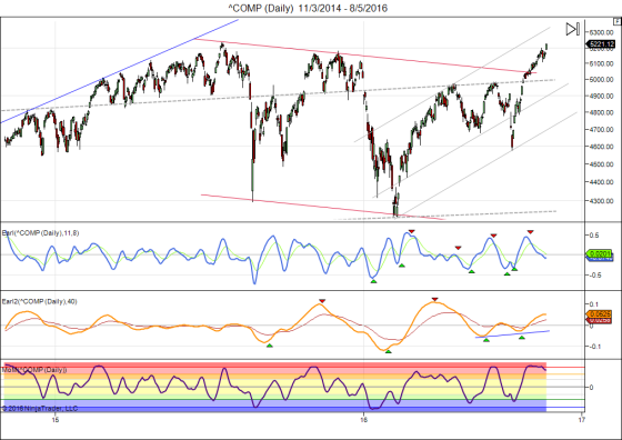
Earl & Earl2

By Danny of LunaticTrader.com

Stock markets kept pushing higher and the recent lunar green period added 121 points to the Nasdaq. Will there be no letup?
Of course the market cannot keep climbing without any pullbacks, so we will get a letup and probably sooner rather than later. Lunar cycles have not done well so far this year, but the recent green period could mark the return of some normalcy in that department. A new red period is getting underway, so we will find out soon. Here is the current Nasdaq chart:
^COMP (Daily)  11_3_2014 - 8_5_2016
The Nasdaq has come very close to its all time high and may break it any day. But my technical indicators are indicating potential problems. The faster Earl (blue line) keeps weakening and may paint a bearish divergence soon. The slower Earl2 (orange line) is flattening out and may turn down any day. The MoM is starting to pull back from a major peak in the +8 euphoric zone. That's not a setup I want to buy, especially not when a new lunar red period is starting.
The LT wave for August is also indicating weakness after a possible top today (+/-1 day).
I wouldn't be too greedy at this point. It has been a great rally over the last 6 weeks, but trees don't grow into the sky. I will take some profits here and then see when the next buying opportunity comes along.
Keep following JustSignals using Twitter, @StockTwits or Follow By Email. Just submit your email address in the box on the Blog homepageThis has been posted for Educational Purposes Only.   Do your own work and consult with Professionals before making any investment decisions.  Past performance is not indicative of future results

Friday, August 5, 2016

SPY - Possible ST caution signs

Courtesy of eSignal
Above is the daily XIV which is above it's upper band today.
Usually it needs time to get back into the bands at lower prices.

Courtesy of eSignal
Courtesy of eSignal
Courtesy of eSignal
The three charts above are the SPY 240min, daily and weekly charts.  Today each has completed a "minimum" of 5 Elliott Waves.  This, if the wave does not change, is usually a heads up for some kind of counter trend move.  The time frame is not known until it starts to happen.  This is NOT guaranteed, as Elliott Waves are not fully confirmed until it is history.  That is why it is only raising a caution flag at this time.

Note that the months of August and September, in the past, have been weak months for the stock market.

Also note that several posts on this blog have indicated a "probable" rise into the year end due to the strong breadth seen in February and June along with some other factors.
So, at this time, it is likely that any pullbacks may become buying opportunities, but, not to be invested in blindly.  This stock market is eight years old and there are many indications that a top is in the making going back to late 2014.

To review stock market valuations, one good website to look at is  AdvisorPerspectives.com By Doug Short
One good article:
http://www.advisorperspectives.com/dshort/updates/Q-Ratio-and-Market-Valuation?utm_source=dshort_feed&utm_medium=rss&utm_campaign=graph_link

If you like this site you can put yourself on an email mailing list to get the updated charts.
Keep following JustSignals using Twitter, @StockTwits or Follow By Email. 
Just submit your email address in the box on the Blog homepage
This has been posted for Educational Purposes Only.   Do your own work and consult with Professionals before making any investment decisions.  
Past performance is not indicative of future results

Tuesday, August 2, 2016

Up 5 Straight Months !


Keep following JustSignals using Twitter, @StockTwits or Follow By Email. 
Just submit your email address in the box on the Blog homepage
This has been posted for Educational Purposes Only.   Do your own work and consult with Professionals before making any investment decisions.  
Past performance is not indicative of future results